
Be Bank App
Be Financial Group is deemed a digital bank for emerging markets. They seek to help areas where people are underbanked and create a digital alternative to address issues of taxation, liability, compliance, all while providing an accessible banking experience. One where it is easier to register and bank from a mobile device.
due to NDA, the images will all be password protected. Please email me for access.
The Brief
When people have no access to a physical bank, they want to sign up for a bank account remotely, so they can manage their finances independently
In many parts of the world, access to physical banks is limited due to distance and cumbersome registration regulations. Not only are there limitations, but many companies are migrating to offering full digital financial solutions. There are many banking apps coming on to the market, but Be Financial Group saw an opportunity to address a particular market and demographic. Be Financial Group tasked us to come up with a solution to make a digital banking experience to simplify the registration process and give greater accessibility to customers, all while remaining compliant to banking regulations.
After our briefing with stakeholders we started brainstorming our next steps. First we needed to further define the problem and separate it into small chunks. Banks have a lot of components and we needed to understand how they work together. That being said, we started to gather data as well as generate a list of goals, motivations, barriers, possible questions, and a plan of attack. These were all assumptions of course, but we needed a direction. This led into our research phase.
After our briefing with stakeholders we started brainstorming our next steps. First we needed to further define the problem and separate it into small chunks. Banks have a lot of components and we needed to understand how they work together. That being said, we started to gather data as well as generate a list of goals, motivations, barriers, possible questions, and a plan of attack. These were all assumptions of course, but we needed a direction. This led into our research phase.
Research
Our research consisted of individual interviews with stakeholders first and foremost. We wanted a better idea of what they think is the problem and where they are coming from. One of the main things we needed to know was context, where and who are the users the stakeholders are trying to sell to. In this case, they identified Asia as the area for business opportunity as well as other smaller countries. Once the user base was identified we were able to perform ethnographic research; consisting of observation and interviews. What we were trying to identify is how people manage their finances on a day-to-day basis. We wanted to see where their anxieties arose and when they seemed frustrated by their current process.
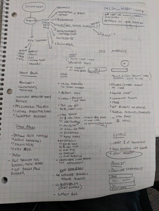
After conducting our interviews we cross referenced our initial research and assumptions to see where there were similarities and differences. In conjunction, we started performing a competitive analysis of other banking apps. There are a lot of banks and banking apps on the market. We needed to understand what is currently on the market and how they are underserving if this is apparently still an issue. This meant testing the apps ourselves, interviewing users, looking at reviews from all sources (play store, app store, forums, twitter)
After conducting our interviews we cross referenced our initial research and assumptions to see where there were similarities and differences. In conjunction, we started performing a competitive analysis of other banking apps. There are a lot of banks and banking apps on the market. We needed to understand what is currently on the market and how they are underserving if this is apparently still an issue. This meant testing the apps ourselves, interviewing users, looking at reviews from all sources (play store, app store, forums, twitter)
Findings
During our research sessions several key points of interest arose primarily about cultural and regional differences. For example; remittance is something not common in North America but it is in Asia and other parts of the world. Several other key points were the frequent use of QR codes to transfer and for payments, in addition to differing regulations to banking compliance. Something I found interesting that you don’t find often, or at least for myself, was that banking apps and banks in general hosted multiple currencies within one account rather than multiple accounts each with their own currency.
Besides from these regional and cultural differences, we found that many users were encumbered and confused by their banks. They found aspects difficult to understand or the user was not told exactly what to expect nor was there a good feedback or support system to address these issues. From our own testing and corroborating testimony from interviews, we found that current banking apps either had too many functions or too little. Leading users to either not know where a function was or the app not being able to complete their task.
With our findings we created customer journeys and sample flows. We used these flows to guide the design phase;
Design Process
We used our findings to help us define our principles and requirements going forward in the design process;
PrinciplesTransparency Clear and predictable Intuitive over Innovation for retention Provide a sense of control to the user Breakdown task into smaller parts Information and details are accessible |
RequirementsCustomer support Remittance Easy to register from mobile Currency exchanges and multiple currencies Follow regulations and compliance QR code payment/transfer |
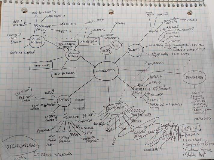
Using the data we collected, we started mapping out use cases and potential features to complete required tasks. From there we made user flows of each feature and what they consisted of. These consisted of text only that way not to influence visuals or distract the team from the key aspects. From these flows we were able to identity the most important aspects of each features and optimal steps to perform tasks.
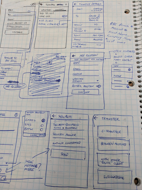
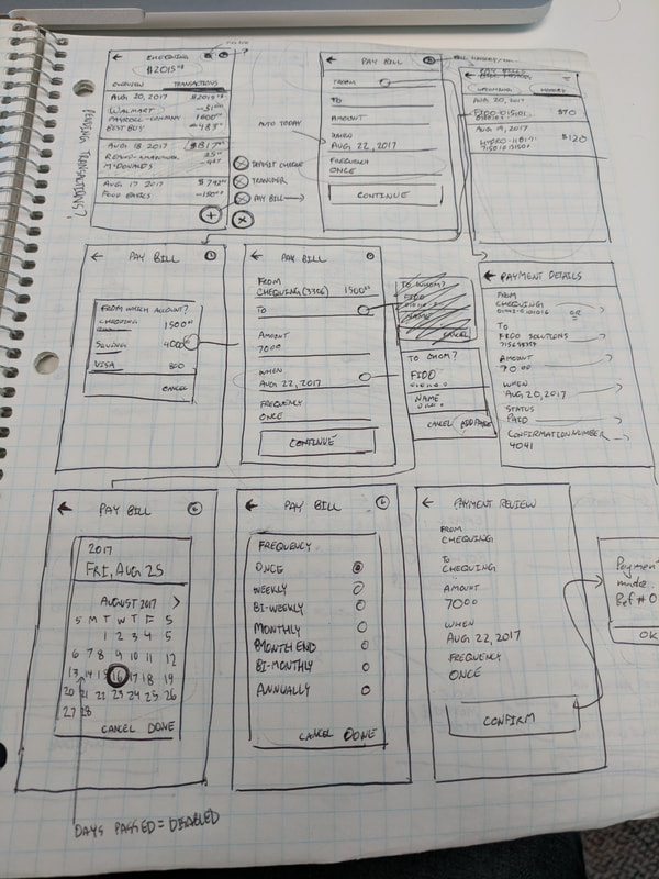
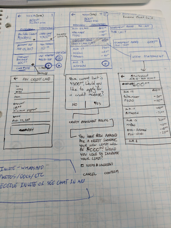
Once the features and flows had a basis, we developed wireframes. Our wireframes were a combination of traditional drawings and digital sketches. After refining our wireframes and flows we moved to testing them with users to confirm we were on the right track. Once the flows were tested we made adjustments based on the feedback and what we observed.
Once the features and flows had a basis, we developed wireframes. Our wireframes were a combination of traditional drawings and digital sketches. After refining our wireframes and flows we moved to testing them with users to confirm we were on the right track. Once the flows were tested we made adjustments based on the feedback and what we observed.
|
|
|
Now that we knew how it would function, for the most part, we started creating a visual style for the app. The visual style was adapted as a design system to speed of development as well as keep the app consistent. From there, we skinned the wireframe flows using the new design system to get a better sense of what the product would look like.

Sample of Design System
|

Sample of Transfer Flow
|
Solution
The solution you see below is still a work-in-progress and is continuing to change based on testing and new information coming in. As mentioned previously, due to NDA I will need to be vague about functions and features.
The app ensured registration was simple and streamlined no matter where a user was located in the world. Normally registering for a bank account would take time and require a lot of documentation but we were able to distill the process and reduce it to a few steps. Onboarding is one of the key aspects to any app, it can make or break it. Ensuring this process was reduced and easy to understand was key.
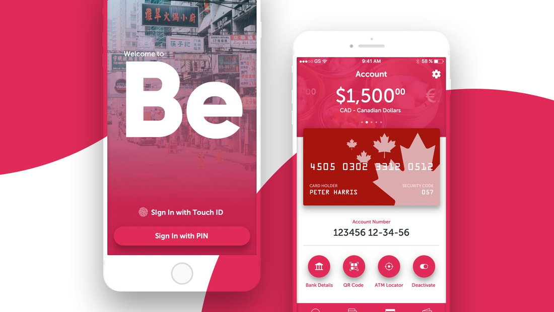
Within the app are 4 main tabs or features; Overview, Transactions, Account, and Transfers.
The overview and transactions tabs made it so the user can identify recent transactions and take action if need be in a clear manner. Every transaction has full details available on tap, they would be able to see when, what type of transaction, who was involved, the amount, region (if applicable), everything the user needs to know to avoid confusion and promote transparency. Users can also see their balance clearly visible at the top at all times as well as a breakdown of the currencies within the account.
From the account screen, users have full control, from deactivating an account to full account details for transfers. The transfer tab hosts every type of transfer the user is able to make; each with a brief description of what they do. Every feature is clearly detailed and explained to the user. Even if a user is having trouble or does not know how to perform a particular task, a customer service option is available within the app. The customer service option hosts our FAQs as well as a direct chat. While we could have added many other functions, we found these are what was most important to our market demographic. Information may change as development continues but the app was made to be modular, meaning it could afford additions or subtractions without compromising the experience or the UI itself.
Future
This project is still in-progress and is evolving with each day. What is currently shown is simply a snapshot in a place in time during the development.
