Disney Radio App
Disney, one of the largest entertainment corporations in the world. Disney has many subdivisions including divisions within the music industry. Radio Disney plays music appropriate for youth. It plays music from all their Disney franchises as well as popular songs age appropriate for kids.
Due to NDA, I cannot show the research and sketches. Other images will all be password protected. Please email me for access.
The Brief
The brief requested for a solution to allow users to listen to Radio Disney channels via mobile devices. They wanted an app that not only played their radio stations but also an app that would help retain users. Many other radio apps people set them to play and forget about them. We needed to keep our users’ attention within the app itself. We were informed that a 3rd party would also be involved as the product was sponsored. The sponsor requested that their brand and partnership be noticeable throughout the design.
Unlike my other projects, the data was already available to us as the research was done by a 3rd party. However, most of the data was still in a raw format and needed to be synthesized. The only research we did on our own was some competitive analysis on other radio apps.
Unlike my other projects, the data was already available to us as the research was done by a 3rd party. However, most of the data was still in a raw format and needed to be synthesized. The only research we did on our own was some competitive analysis on other radio apps.
Findings
There were 3 radio stations within the app with the chance of an increase in the number of stations in the future. The data showed us that our primary demographic was 8 – 14 year olds, primarily girls. Our child demographics such as 3-8 would also be included but not as prominent. Kids in this demographic may not necessarily be able to distinguish between an ad/sponsorship and content. Being Disney, they pride themselves on being kid-friendly; they would not want any semblance of any predatory intent with their content. Thus, we needed to ensure that content and ad/sponsorship was distinct from each other even for children to understand the difference.
The data also showed us that kids were interested in other forms of content related to music. Ranking them from music videos, photos, events (such as concerts). As stated earlier, we need to retain users. One of the best ways for retention was to involve the user, participatory design. We needed to add the ability for the user to engage the content and participate in order to feel invested to return.
Our secondary demographic were parents. The content also needed to appeal to adults as all Disney content does. Consider that parents watch Disney content with their kids. Disney acknowledges its adult audience by interjecting jokes that aim toward them that kids would not get or understand. As a result, we needed to ensure that parents are considered in the final design.
Requirements
|
Prominently display sponsors’ brand
Design for kids and parents Distinguish between ads and content |
Increase retention within the app itself
Incorporate other forms of media Play & switch between Disney Radio Stations |
Design Process
After we solidified our requirements, we started to list out possible features. From this feature list, we generated skeletons for our user flows using only text. We focused on several major use cases to start. Throughout the design sprint, we were in consist contact with Disney representatives who would review any work produced and tell us if Disney or the sponsors thought we were on the right path or something needed to be changed. After we cleared the flows with the stakeholders, we moved on to wireframing the primary user flows. As we sent those wireframes for review, we started wireframing the hedge and secondary flows as to not waste time.
Once all reviews of wireframes were complete, we moved on to mock ups. The mock ups took on a modern aesthetic; one that focused on content rather than overly designed. We needed to make sure, the content was easily accessible to both parents and children. We also needed to make sure the aesthetic matched Disney and sponsorship branding all while making it similar to other radio apps (or at least what worked with those apps). It was quite the balancing act, one that took many iterations and back and forths.
We tested the designs via html prototypes with several small focus groups which were conducted by Disney. We received all feedback and incorporated any changes that we saw were a major problem. As those changes were being made, we polished up the transitions between screens and animations for elements such as the radio station selector.
Solution
Below is an early iteration of the design. Due to NDA I am unable to show any later iterations or development.
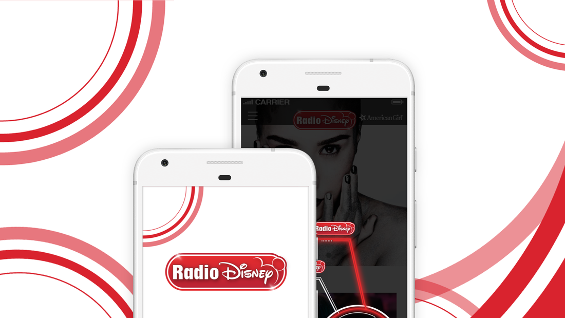
The design made content king. Text was minimal. Even titles existed within the frame of the content rather than taking up their own space. The key feature of selecting radio stations took the form of a floating button similar to android. When tapped and selecting the station, the visual element resembled that of iron man’s interface from the movies. His interface held a modern aesthetic but also fit within the brand of Disney as it was one of their properties. This was just one example of how we incorporated modernity with the Disney brand to create a radio app. We made sure sponsor was quite visible to appease the 3rd party sponsors while not interfering with the design. In addition, all ad content were not only marked with “ad” text, they also appeared visually different so parents and children alike could differentiate. A hamburger menu was used to house most of the features, however, was not mandatory as a user could navigate to most of the content via the home screen.
In terms of functionality, a user would select the floating button to bring up the radio selector. Once selected, the audio would play with a small interface informing the user what is playing. This interface was passive that way the user could navigate the rest of the app without interrupting the music.
To increase retention we incorporated participatory features such as sweepstakes, song requests, votes. These features allow the user to be involved within the app, either giving them a chance to win something or get their voice heard.


