APrivacy File Sharing Application
APrivacy provides security of files and information for the financial industry. The security operates behind the scenes and is integrated with any file type or device, meaning users can send secure information anywhere, any time, and how ever they wish.
due to NDA, the images will all be password protected. Please email me for access.
The Brief
How can bank employees share confidential information with each other in a seamless and secure manner at any time or anywhere?
Security is always an issue when it comes to sharing information. With the increasing use of mobile and online banking, security has become paramount. Currently, file sharing solutions have limited security but are user friendly. On the other hand, security solutions are cumbersome and complex leading to low retention rates. Bank employees need something that is both user friendly and secure.
Before jumping into any possible solutions, we needed to understand what they are currently working with and going through. The first thing we did was try out the current solutions to gain insight and empathy into their predicament. This put us in their frame of mind. We documented our experience and listed our own issues that we could see. We then went through reviews of the current solutions; be it on app stores, forums, and reddit.
We saved the data from our own analysis to validate against that of the stakeholders’ interviews (bank employees); whether we were correct or not about our assumptions. We used the data to generate more specific questions to ask during the interviews that way they have context. In a way, our data served as a benchmark or a leaping off point for us to continue our exploration and research.

Findings
After consulting the stakeholders, it was apparent that the brief did not cover the full scope of the issue nor did it address the most important issue. The brief never mentioned the clients but from the findings it was clear this was the primary focus. It would be important to involve and test with clients as we progress through development.
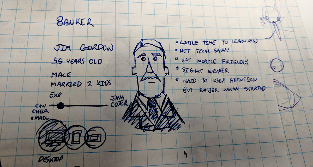
We mapped out the user journey and made scenarios/user stories instead of focusing primarily on personas. What we did know is there are 3 types of users; Banker, Executive, and Client (client can actually be broken down into 3 of its own that being high-wealth, Family Person, Young Adult because each would most likely be in a different financial situation).
We mapped out the user journey and made scenarios/user stories instead of focusing primarily on personas. What we did know is there are 3 types of users; Banker, Executive, and Client (client can actually be broken down into 3 of its own that being high-wealth, Family Person, Young Adult because each would most likely be in a different financial situation).
There are regulatory restrictions that stop employees of the financial industry to share information across unsecure channels such as; email, or text. If caught, heavy fines or even imprisonment could be doled out. Employees could only secure files within an enclosed environment, whether that be a folder or web-based application. Meaning, the recipient would also only be able to access the files from this single point. However, clients want to access their information via other channels or devices, putting the employees in a tight situation of follow regulation or keep the client (which both could result in loss of employment). Clients were found to always be hesitant to adopt new software not only because it was foreign to them but also because of the type of information they were providing.
Bank employees and clients both had to also use multiple passwords and tokens to create an account or login. The process could take up to 5 minutes just to open a file.
The security for most of the software was based on the file container, meaning if the information ever left that container it would be unsecure. The data needed to be secure at all times in order to fit the regulations, which is why clients were forced to use the same channels as the employees.
TL ; DR Summary
|
Weak security
Inconvenient (lacks integration with Common communication channels) Cumbersome login (tokens, passwords, etc) |
Takes time to do anything
Intrusive security forcing users into a silo Usually unfamiliar resulting in hesitation |
Design Process
We synthesized the data to generate a direction for the project. We came up with principles as well as product requirements;
Requirements
Majority of actions be one step if possible
Invisible, only show what is needed at that moment
Emersion and Unintrusive
Intuitive over Innovation for retention
Gain user trust (transparency, informative, aesthetic)
Invisible, only show what is needed at that moment
Emersion and Unintrusive
Intuitive over Innovation for retention
Gain user trust (transparency, informative, aesthetic)
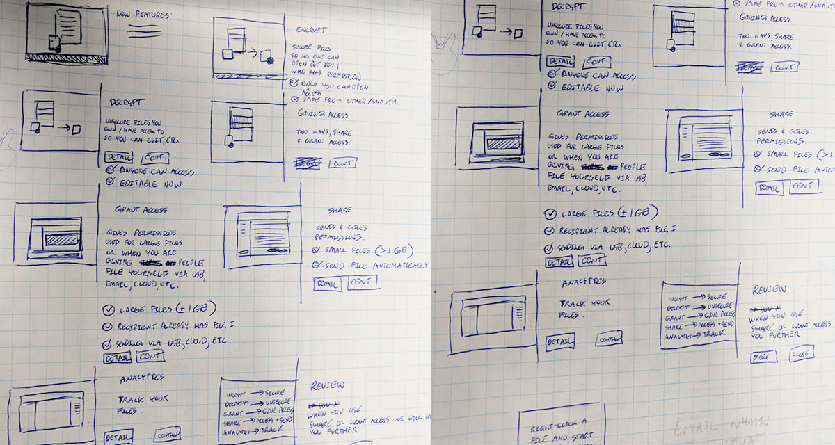
We knew the application would be on desktop. We used the user journey maps to identify the features that would be needed for the application. Once all the features were identified, we started testing out possible journeys from the features. We didn’t use any UI assets or visuals yet because we didn’t want to be influenced one way or another this early.
After the journey maps were complete, wireframes were made to see how and where features would sit. We incorporated the wireframes into our existing user journey that way the team and stakeholders could visualize the process. We identified the primary use cases and started to look at hedge cases (errors, different user actions, etc.) The team, stakeholders, and external testers all went through the flow to help identify holes and issues. Once completed, we finally got to skinning the wireframes.
In the middle of early development, we received new feature requests. As we were examining the new features, we realized there that the design was not flexible enough to adapt. In addition, through this examination, we identified holes in the design that did not cover particular use cases that the stakeholders recently disclosed. As a result, we started the design over. It would have been like using a bandage on a leak. It was better to come up with a better design while we were still in the early stages. We tested the new design with users and stakeholders to find out if there were any more holes or issues before making a release build.
In the middle of early development, we received new feature requests. As we were examining the new features, we realized there that the design was not flexible enough to adapt. In addition, through this examination, we identified holes in the design that did not cover particular use cases that the stakeholders recently disclosed. As a result, we started the design over. It would have been like using a bandage on a leak. It was better to come up with a better design while we were still in the early stages. We tested the new design with users and stakeholders to find out if there were any more holes or issues before making a release build.
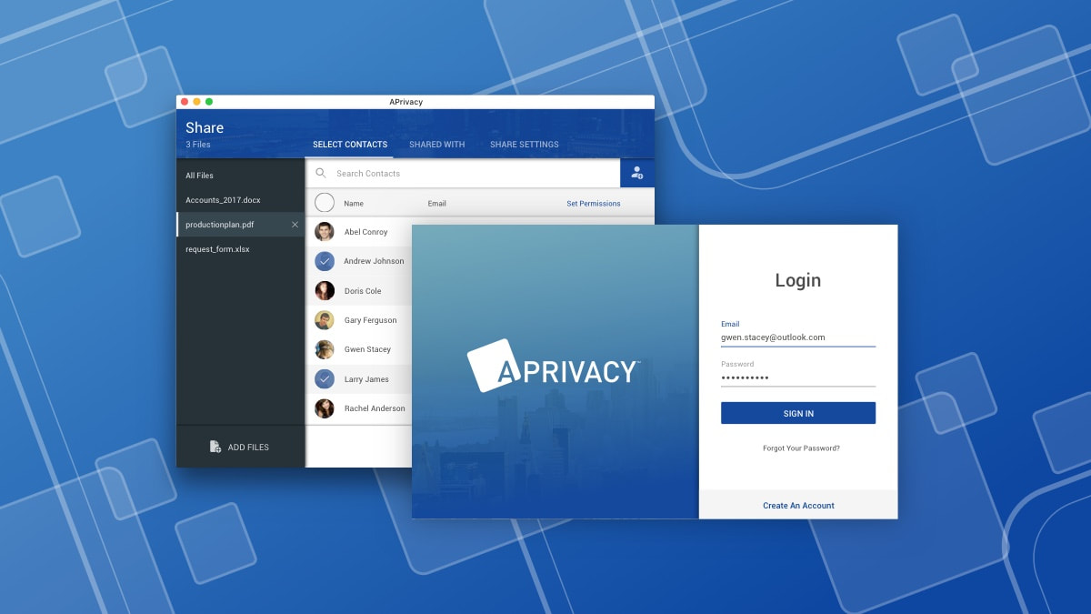
Solution
The current solution looks like this below; The application runs behind the scenes as to not interfere with the user (via task bar). The only time the user will see the application is if;
- They open a secure file
- secure a file
- share a file (which encrypts it if not already)
- decrypt a secure file

The onboarding process requires only a few steps as to get the user to their primary goal as quick as possible. This process needed to be seamless, as for all applications, first impressions are everything. All users, whether they were new or existing would only need to enter their email address. Our system would determine whether they were new or existing which helped reduce onboarding time by 5 secs. As a security application, there needed to be a balance between easy and secure. Thus we made sure account authentication was handled primarily behind the scenes (used email and device ID).
The hardest thing we needed to do was generate trust with the user. The application was made for 3rdparties, while we could not influence a user’s trust with that party, we needed to do it through our aesthetic and messaging. We emulated particular aesthetics of products our users already use and trust. We needed to be sure our user was comfortable approach this new product so giving them something that resembles a product they already use made it more approachable. All the content and messages needed to be clear and tell the user what is happening. Transparency is key to trustworthiness. Every message we showed the user was contextual to what was happening on the screen. We never made the messages lengthy because that would defeat the purpose of our “one step” principle.
The hardest thing we needed to do was generate trust with the user. The application was made for 3rdparties, while we could not influence a user’s trust with that party, we needed to do it through our aesthetic and messaging. We emulated particular aesthetics of products our users already use and trust. We needed to be sure our user was comfortable approach this new product so giving them something that resembles a product they already use made it more approachable. All the content and messages needed to be clear and tell the user what is happening. Transparency is key to trustworthiness. Every message we showed the user was contextual to what was happening on the screen. We never made the messages lengthy because that would defeat the purpose of our “one step” principle.
Future
This project is still in-progress and is evolving with each day. What is currently shown is simply a snapshot in a place in time during the development.
