Overwatch "Mercy" CheckUps App
Overwatch is a team based multiplayer hero shooter game developed by Blizzard Entertainment. Each hero within the game have their own personality and quirks that make them special.
The project encapsulates 3 products as all relate to Overwatch. These products are for my own benefit rather than a client. Video games in general each have their own unique worlds. They have their own set of rules and persona archetypes. As a result, video games are a great incubator for design problems that may not arise in the real world. It really challenges your thought process in an unconventional way. A solution that arises from trying to address these problems may be applicable in the real world as well. It’s all how you frame the problem and relate it to existing issues.
Each of the 3 products are inspired by 3 unique heroes in Overwatch. Each hero persona has their own set of wants, needs, and motivations. What these products do are address an unfulfilled need for the hero that could also exist as a real product within our own world. Each of the products are small in scope but directly address a specific need. In addition, these products could serve as a basis for a much larger project (bigger team, more funds, investors)
Product Discovery
Unlike the previous two, Mercy had a singular drive, or at least a motivation that is present in everything she does. While conducting my research I noticed a trend. Her personality could be broken into 2 subdivisions; one would be as a medical professional while the other would be more maternal. Despites her dual personality traits, one could argue that all her motivations are related to caregiving.
Every voice line, character interaction, personality trait, all suggested she was primarily concerned with taking care of others. Listing all her needs, wants, and motivations were simple as one could gather. While finding her motivations were simple, trying to find a distilled design problem was not. Caregiving is broad and could mean anything even in terms of a medical professional or parent. I needed to narrow my focus. I started to document what a caregiver would go through; I sketched out the caregivers daily user journey (several actually to account for the dual aspect of her personality being maternal and a medical professional).
Every voice line, character interaction, personality trait, all suggested she was primarily concerned with taking care of others. Listing all her needs, wants, and motivations were simple as one could gather. While finding her motivations were simple, trying to find a distilled design problem was not. Caregiving is broad and could mean anything even in terms of a medical professional or parent. I needed to narrow my focus. I started to document what a caregiver would go through; I sketched out the caregivers daily user journey (several actually to account for the dual aspect of her personality being maternal and a medical professional).
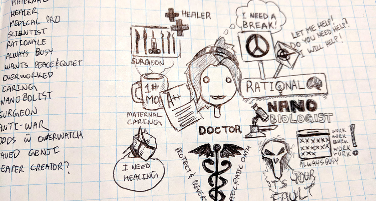
I also started to look at my data again. I noticed that Mercy is constantly asking the other characters about past or current ailments. She presses them on receiving a checkup or treatment. I decided that this would be my launch point. Mercy needed a way to help her colleagues or/and patients. This could be making sure they receive check ups and treatments. It could also be making sure she can keep tabs on their condition. Mercy is a healer after all, she needs to keep all her teammates alive which can be difficult at times.
I know from visiting my doctor’s office and going to the hospital, it can be difficult to keep track of all details about a patient; especially past ailments and treatments. So if one improves that line, maybe it could help people get better quicker and reduce patient loads on professionals (especially in Ontario where I am from, as wait times are average 6+ hours). With these facets in mind, I posed the question as a medical professional;
I know from visiting my doctor’s office and going to the hospital, it can be difficult to keep track of all details about a patient; especially past ailments and treatments. So if one improves that line, maybe it could help people get better quicker and reduce patient loads on professionals (especially in Ontario where I am from, as wait times are average 6+ hours). With these facets in mind, I posed the question as a medical professional;
How might we help medical professionals keep better track of their patients’ ailments, treatment, and appointments to reduce wait times?
I have seen medical based apps before, each have their own focus and stakeholders. In this case, I know my stakeholder is a doctor. So, whatever I designed would be from their point of view. A lot of the apps I saw were geared toward the patient; either helping them find help, get better, or track their own wellbeing. I was a bit overwhelmed with the number of apps. None really stuck out to me. It was more of Frankenstein-ing ideas and concepts that worked and did not. I was now ready to move on to the product itself.
Design Process
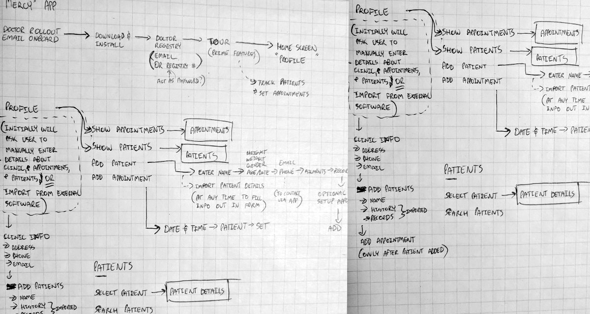
I incorporated info I learnt from my analysis of other medical apps during my brainstorming to spark more ideas. I knew the app would track patient info, so I listed out aspects that go with it. From there I was able to come up with a user journey to flesh out my feature list. I generated a user flow with wireframes. I moved on to prototyping the wireframes. In doing so, I discovered some things either did not work or were not properly thought out. I made some amendments to the wireframes and started the mock ups.
Principles
Gentle, Soft, and Calm
Clean (like a medical facility)
Clarity over aesthetic
Shallow over boldness
Peaceful and airy
Clean (like a medical facility)
Clarity over aesthetic
Shallow over boldness
Peaceful and airy
My style guide included my palette, typography, forms, and app icon. The palette, similar to Mercy’s armor, is minimal and muted. Which suits the subject matter. Medical facilities and professional attire are generally white representing cleanliness and purity. Any colour in my palette would be to call the user’s attention or for interactions. A vibrant palette would not sit well with my ‘calm’ principle, as vibrancy may be anxiety inducing.
I chose Avenir for my typeface with large character spacing. I found this was the best choice. The characters were bold and distinct, making them legible and clear. The increased character spacing made it airy and soft. In addition, most titles were set to lower case so they did not seem to yell or be too excited toward the user to continue the theme of calmness. The forms took inspiration from Mercy’s armor and personality. I rounded edges of elements to reflect Mercy’s peaceful demeanor. I used a generous amount of space between elements to emulate her minimal style and give it a cleaner look. For the app icon, I referenced Mercy’s wings combined with a becker to reflect the medical aspect.
I chose Avenir for my typeface with large character spacing. I found this was the best choice. The characters were bold and distinct, making them legible and clear. The increased character spacing made it airy and soft. In addition, most titles were set to lower case so they did not seem to yell or be too excited toward the user to continue the theme of calmness. The forms took inspiration from Mercy’s armor and personality. I rounded edges of elements to reflect Mercy’s peaceful demeanor. I used a generous amount of space between elements to emulate her minimal style and give it a cleaner look. For the app icon, I referenced Mercy’s wings combined with a becker to reflect the medical aspect.
Solution
Below is a presentation of the solution called “checkUps” (referring to the fact that it tracks patients and their medical records).
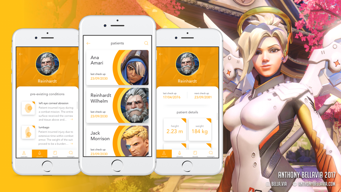
Patient Ailments Screen
The left screen shows the selected patient’s pre-existing conditions. A user can tap the arrow icon at the end of each paragraph to see more details about the condition. At the bottom of the screen is a tab bar with 4 options; overview, ailments, records, and messages. The overview will be discussed shortly and the user is already viewing the ailments.
The records tab will show all the appointments and any documents pertaining to the patient. The messages tab allows the user to directly communicate with the patient. The user can send messages here and the patient will receive them via their preferred form of communication. Lastly, the back arrow at the top will bring the user to the patient list screen.
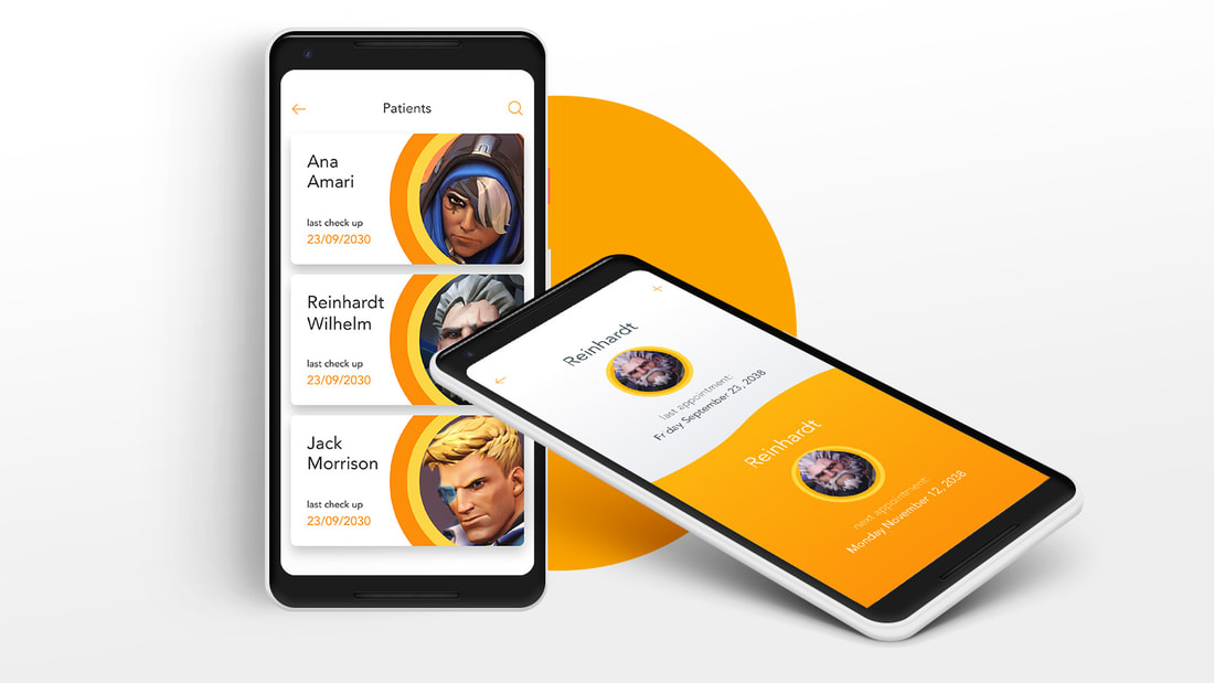
Patient List Screen
The middle screen shows a list of all the patients. The user can search through the patients via the search icon at the top right corner. Back button leads to a feed with all updates and messages from all of Mercy’s patients. In addition, the user can add new patients on this screen. When the user taps on a patient, it will open a patient overview.
The middle screen shows a list of all the patients. The user can search through the patients via the search icon at the top right corner. Back button leads to a feed with all updates and messages from all of Mercy’s patients. In addition, the user can add new patients on this screen. When the user taps on a patient, it will open a patient overview.
Patient Overview Screen
The right screen shows an overview of the selected patient. Each item highlighted in orange is selectable. The user can change any of the data sets by simply tapping them. As mentioned earlier, there is a tab bar available to the user.
The right screen shows an overview of the selected patient. Each item highlighted in orange is selectable. The user can change any of the data sets by simply tapping them. As mentioned earlier, there is a tab bar available to the user.
