Vidyard Report Center
Vidyard is a video hosting platform. The platform enables users to record videos and then share them however they wish, whether it be email, chat apps, hosting on their website, you name it. Vidyard allows its users to customize the branding of videos as well as control the security options who can view them. What makes Vidyard powerful is its analytics and CRM/MAP integrations; the analytics empower users to understand and gage the success of their content. These features along with others make Vidyard a great tool for video communication.
Problem Space
Part of Vidyard’s value proposition is the availability of deep and detailed analytics on video viewership. Vidyard primarily has Sales and marketing customers both value analytics to understand who is watching, how much they are watching, where and when, as well as other in depth viewer details. These analytics help our sales and marketers determine who they should reach out to as prospects/leads as well as which content is successful in getting engagement. In Vidyard, customers can run reports to receive these analytics in the form of excel sheets for easy consumption of individuals and integrations (such as Salesforce and Marketo).
Objective
When I was initially brought on to the project, Vidyard was in the middle of updating and revamping the entire platform for 2 reasons; meet required legal accessibility standards (WCAG 2.0) and update UI to a more modern look and feel. However, after looking at and trying the reporting experience myself I had doubts and questioned the intention.
The overall experience had a few holes and issues so I was concerned with bringing these same experience flaws into the updated UI. I made the UX issues known to the team using a few examples; asking the team are we ok with these problems persisting. After much discussion the team was open to updating the overall experience as well which became our primary goal as we moved on to conduct research to narrow down the scope, issues, and define our official problem statement.
The overall experience had a few holes and issues so I was concerned with bringing these same experience flaws into the updated UI. I made the UX issues known to the team using a few examples; asking the team are we ok with these problems persisting. After much discussion the team was open to updating the overall experience as well which became our primary goal as we moved on to conduct research to narrow down the scope, issues, and define our official problem statement.
High Level Objective:
Improve the overall experience of reports
Improve the overall experience of reports
Research
We wanted to conduct multiple methods of research to understand the use case and users. The methods were as follow;
|
User interviews
We conducted interviews with various members of our internal team (customer success & sales team members) and external customers. Our internal team worked closely with the customers as well as having extensive knowledge of Vidyard. We wanted to understand how they use reports, what they expect from them, what kind of data they expect, pain points, and their general use case. We used the data captured from the interviews to help flesh out our key findings seen in the section below. Data Audit & Card Sorting Exercise
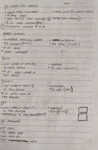
Audit all data in reports. We wanted to know all the data we offered to our customers in each type of report. Using the data from the audit we started a card sorting exercise to organize and rank data using internal stakeholders and customers to see what they value and do not value. |
Competitive Analysis
We went through our direct competitors report process as well as popular data analytics platforms. We documented each one in the form of user journeys, marking any key benefits or drawbacks. Review Report Usage Data
We wanted to see how many and which users used reports. Some key metrics we looked at were; how many reports were run daily, weekly, monthly, etc? What types of reports were run? How many were set to recurring report cadences? Review Customer Support Tickets & Feedback
We gathered and synthesized all feedback into categories and documenting the number of issues in each category so we can prioritize needs. |
Key Findings
We talked already briefly about the personas that use reports and why they do so, to recap we framed them into jobs-to-be-done. Here are so examples;
|
When a Sales rep sends out prospecting videos, they want a report on the viewership analytics to see who watched so they can reach out to the viewers as interested prospects to sell to.
|
When a content marketer runs a report on their latest blog videos, they want to see which videos were engaged the most so they can make similar blog videos to repeat the success.
|
We synthesized our findings from our competitive analysis, feedback, and interviews into key pain points for us to try to address;
- Difficult to understand what data reports will give and understand how to get specific data
- Confusing process (where to run reports, where report ends up, etc.)
- Overwhelming options, don’t know what does what
- Segregation of scheduling recurring reports and one offs created frustrating flows
HMW:
How might we ensure customers understand how to get the data they need and want when running reports?
How might we ensure customers understand how to get the data they need and want when running reports?
Solutioning
We made several decisions to directly address some of the user issues and UX flaws;
Report Data Based on Insights Dashboard
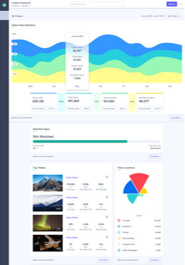
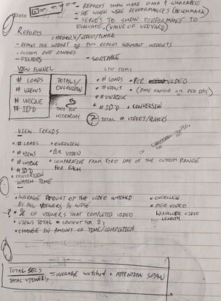
Based on our data audits and card sorting exercise, we determined it would be easier to correlate our report data with our insights dashboard. Our dashboard is broken into separate digestible widgets, but they are all focused on surface level data. We thought we could make it so the reports mirror the dashboard but just go more detailed. So reports could be broken down similar to our dashboard widgets and named the same. Doing this would potentially make it easier for users to understand what data they get back.
Based on our data audits and card sorting exercise, we determined it would be easier to correlate our report data with our insights dashboard. Our dashboard is broken into separate digestible widgets, but they are all focused on surface level data. We thought we could make it so the reports mirror the dashboard but just go more detailed. So reports could be broken down similar to our dashboard widgets and named the same. Doing this would potentially make it easier for users to understand what data they get back.
Change Occurrence
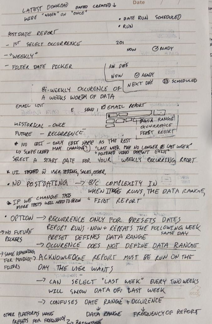
We wanted it so users can decide during the process whether they want a report to be recurring or not similar to how you can decide if a bank payment will be recurring while paying a bill.
We wanted it so users can decide during the process whether they want a report to be recurring or not similar to how you can decide if a bank payment will be recurring while paying a bill.
Add Slight Friction For Better Comprehension
We wanted to break up the report generation into steps similar to checkout processes you find on ecommerce websites. Breaking up the flow into steps reduced would reduce the complexity of the task by making it into easier smaller tasks. This small bit of friction could allow our users to better understand what they were generating.
We wanted to break up the report generation into steps similar to checkout processes you find on ecommerce websites. Breaking up the flow into steps reduced would reduce the complexity of the task by making it into easier smaller tasks. This small bit of friction could allow our users to better understand what they were generating.
Sketching
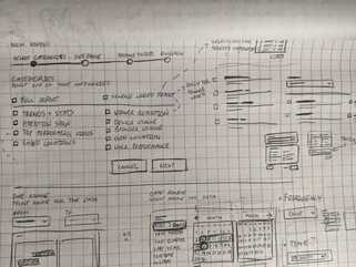
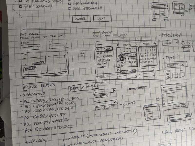
I generally like to start with text based info architecture and sketches. I can produce sketches a lot faster to come up with different ideas and wireframes. I referenced our competitors (both direct and indirect competitors) screens and flows to generate ideas as well as common patterns I have seen in the past related to checkouts.
After coming up with some options I invited the design team, devs, QA, and my product manager to offer me feedback and so they also had a general direction I wanted to go with the design. These early sketches allowed our dev team to start exploring the backend work needed to achieve some of these ideas or even see if they were feasible.
Once I documented all the feedback, I started on my first iteration of mock ups. While designing I had several considerations to guide me;
I went through many iterations, ideas, layouts and the sorts to find the right one. After receiving multiple rounds of feedback, I finally had a version I wanted to prototype using Usertesting.com. I mocked up the screens for a click-through prototype and wrote a real world scenario for users to follow while trying it out. Based on the results, I made a formal document going through the variables, results, and key findings/potential actions. See samples of iterations below (4 of 48 total variations);
Once I documented all the feedback, I started on my first iteration of mock ups. While designing I had several considerations to guide me;
- Scalable patterns: Whatever I designed I wanted it to be scale and be modular to account for additional features in the future so everything didn’t need to be rebuilt from scratch.
- Accessible: Under the Ontario mandate, we needed to be WCAG 2.0 compliant or face hefty fines
- Maintain Vidyard consistency and tone: It had to look like it was a Vidyard feature, had to ensure we are maintaining consistency
I went through many iterations, ideas, layouts and the sorts to find the right one. After receiving multiple rounds of feedback, I finally had a version I wanted to prototype using Usertesting.com. I mocked up the screens for a click-through prototype and wrote a real world scenario for users to follow while trying it out. Based on the results, I made a formal document going through the variables, results, and key findings/potential actions. See samples of iterations below (4 of 48 total variations);
Final Mocks & User Flow
With all the feedback finalized I came to our final iteration for the project. In addition to the mock ups for each major screen, I created the user flow for the entire process. The user flow included hedge cases, branching paths, and fully documented expected behaviour below each screen. See the entire flow diagram by clicking the image below.
TLDR Version;
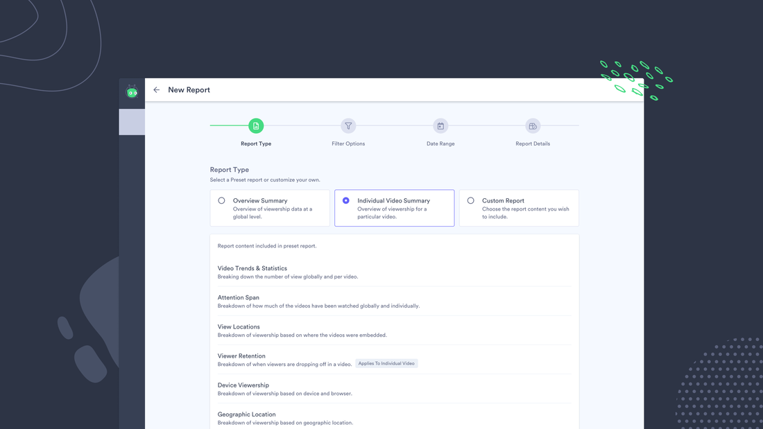
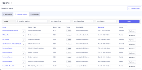
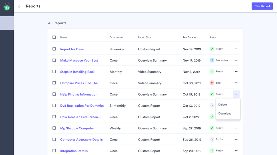
The base flow starts users in the reports page where they can see all their reports and their details.
The base flow starts users in the reports page where they can see all their reports and their details.
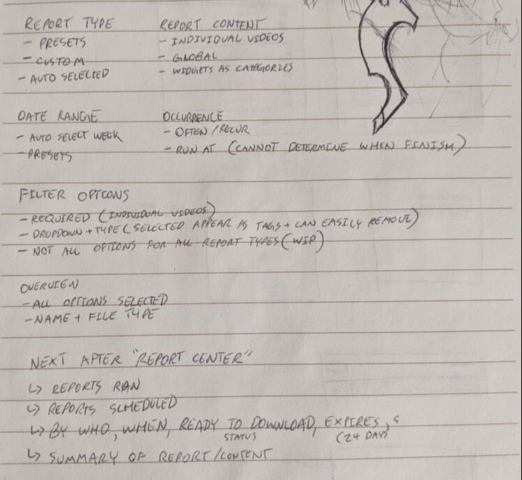
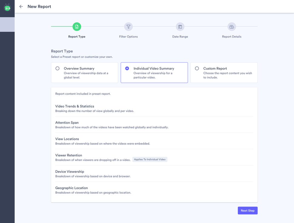
When the user clicks a new report, the first step is for them to select the report type. Each report type includes a full list breakdown of what that report contains (based on the insights dashboard widgets).
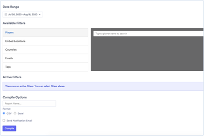
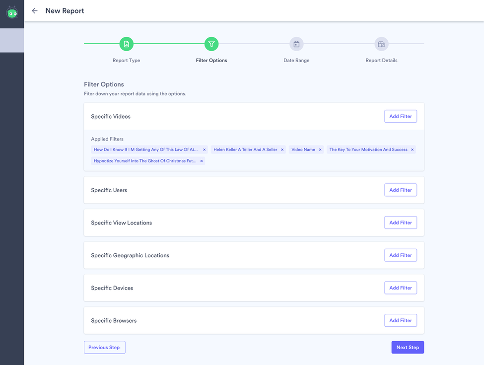
Once they confirm their report type, the user can add filters so the data is more specific. When the user adds filters, they appear as tags which the user can easily remove if they change their mind. From a development standpoint, each filter card is independent and modular so it is easy to add or remove filters in the future.
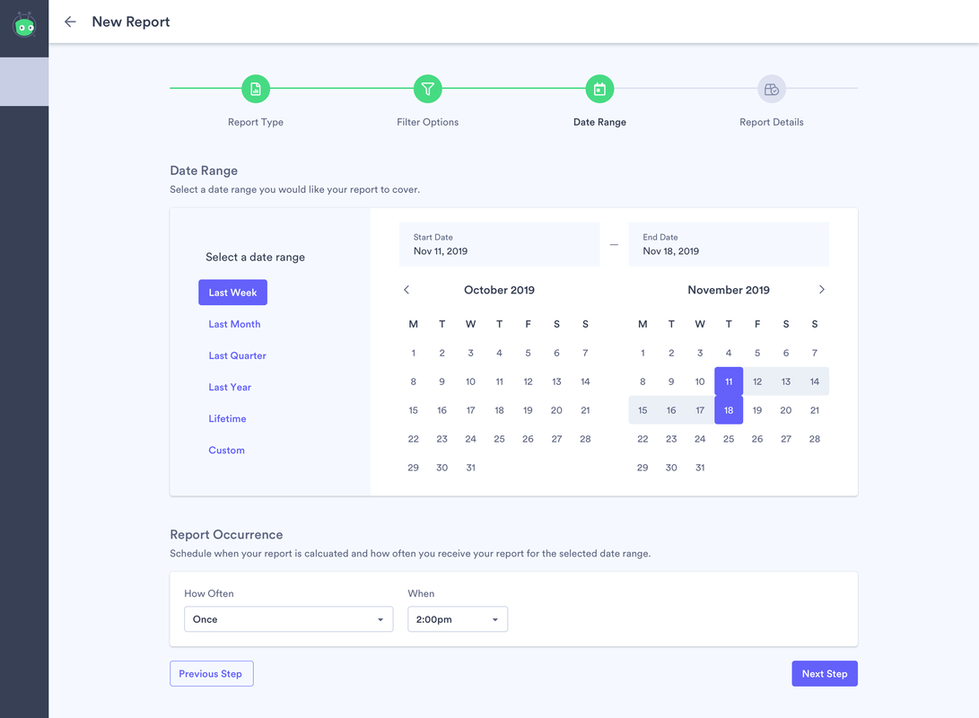
After setting the filters, the user must select a timeframe for the data. Here is where the user could set whether they want the report to be recurring or just a one off. Note; if the user selected a date range that did not include up to “today” they would not be able to set it to recurring because it would be difficult to set something to recur when it was a random week months ago.
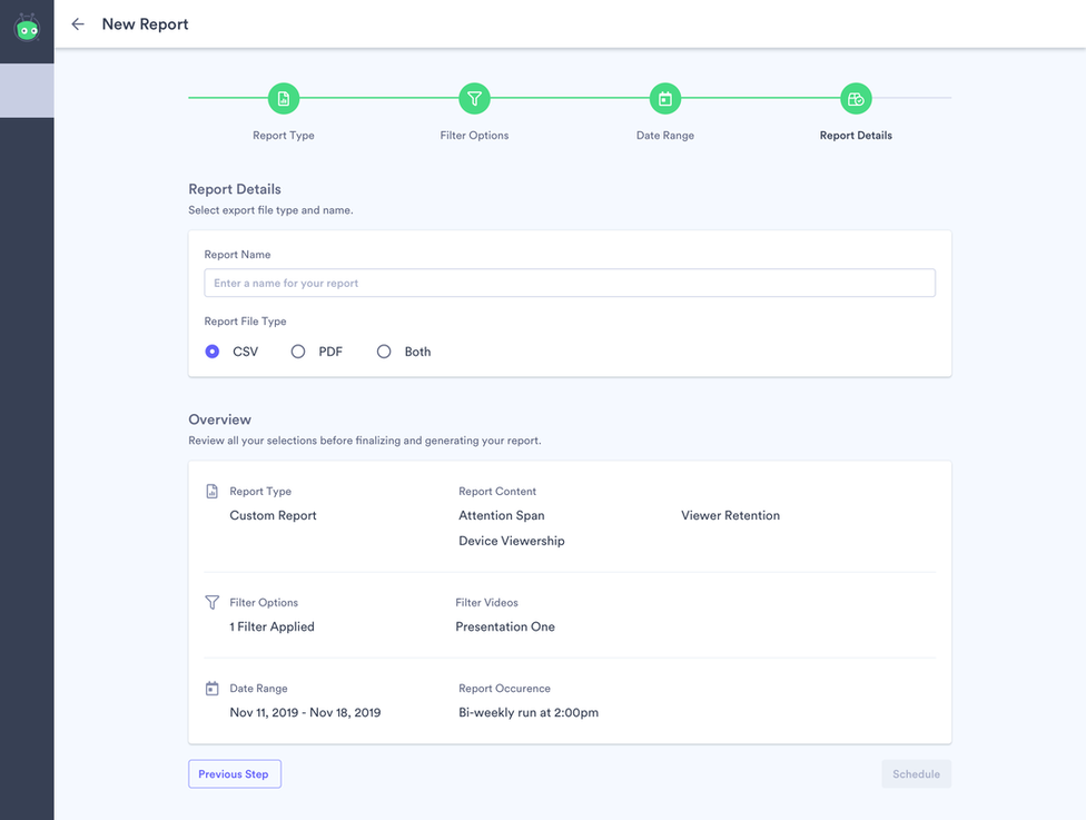
The final step is where they enter a name and are able to see an overview of the report they will be creating. Once generated, the report itself is an XLSX file organized so that each tab contains in depth data related to its associated widget from the insights dashboard.
Future
This project is still in-progress and is evolving with each day. What is currently shown is simply a snapshot in a place in time during the development.
I ensured that it would be easy to add additional report types using the card style. The idea was that users could even make their own presets and save them as report types but due to time and other limitations we had to postpone this feature.
We also limited the number of filters initially because we were running out of time, but because the design was so modular, we were able to add new filter options with relative ease.
We were also considering a variation of custom reports where we allow the user to customize the file output itself. So the user would be able to select what data they wanted in each column for a fully customized report.
