  Hey all! Gonna be busy for a while with work stuff so here's two infographics based on the movies and TV shows I watched this past year. Enjoy! Wanna see the details? CLICK BELOW.
 Last of but not least, the mock ups are here. This app is meant to be used by Joel, the main character, of The Last of Us game. The idea came up from a night with the guys. We were talking about how do characters know what to do or how to do something. So I thought maybe they have an app for it!
Now let's go through it shall we. In terms of overall aesthetic I tried to mimic the UI in the game. It has a restricted palette relying heavily on overlays and floating GUI. They do this to let the content be the star; they let it have breathing room to work and capture the player. They use a lot of white text, it works for the game because there is not a large amount of body type. The UI elements are generally white and sit on top of a darker overlay to create some contrast. Now for my work. I mimicked the restricted palette using visual hierarchy and contrast to draw focus. I chose to use DIN because the game's UI uses it (or at least it looks like it does). I chose to show the main screens and ones that had a major difference from the others. The HOME screen background changes based on the time of year. The game uses the seasons to mark chapter transitions so I thought it would be neat to use to keep track of seasons. This page's content comes from the FEDRA and the military but the Fireflies (a rogue group) has something to say ;). The NAV uses the same styling as the game's menu. One feature has a drop menu for more options. RULES OF SURVIVAL is all about informing. Teaching the character how to survive and what to look out for. The character can navigate within a topic through the top option bar. Ellie (other main character) likes puns (so do I) I decided to add humor here as keeping a level head in this situation is important and humor could help people relax. Humor differs from the rest in this feature as you tap the question to reveal the punchline and tap again to hide it. Infected is similar to crafting style UI but I will get to that shortly. Crafting shows all the craftable items. clicking an item brings up the details of the object such as material needed and how to make it. As mentioned the infected UI would look similar, it would show all infected and clicking one would bring up details about it. The MAP allows the character to search locations. Once a location is entered the app will show a route from the current location to the destination. The character could drag the current or the destination points to other locations. Above the locations are information boxes where the character could save a location by tapping the bookmark icon. Clicking the arrow will identify the character's current location. Clicking the target icon gives information about the destination and moves the map to it. The information provides distance but not provide time as it may fluctuate due to infected, road blockades, and other detours. Clicking the top bookmark icon brings up the saved locations that one could set as a destination. I know this is post-apocalypse and satellites may or may not work so I thought they would use radio and other towers to get signals and calculate distances (I don't really have an answer here but I did think about how this could work). Lastly, ECHO LOCATION. Some how Joel can see like a bat. I thought he could use the phone to capture video and use the phone's built-in audio capture to identify where a sound is coming from and project a low frequency sound back to produce a sonar like image (again, (I don't really have an answer here but I did think about how this could work). Wow, this was a long one. I probably missed something as we all do. I do believe nothing is perfect that is why we have iterations; to continue to improve one's work and self. Anyway, enjoy! Might prototype this as well next time. 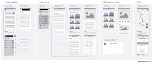 Next step, wireframes. Now is the time to actually see how the app could possibly look. I find wireframes are essential not only for UI but the UX process. User flows are great but the are vague and ambiguous. Wireframes help figure out details such as "oh, I need a button here" or "oh this needs to expand so I need another screen in my flow". So I tend to go back and forth adjusting the user flow accordingly. While coming up with the wireframes I reflected on the game's UI and personality to match it in terms of flow and style. I blocked out the name of the game, sorry you will have to wait a bit longer. Up Next, mock ups! Happy Holidays!
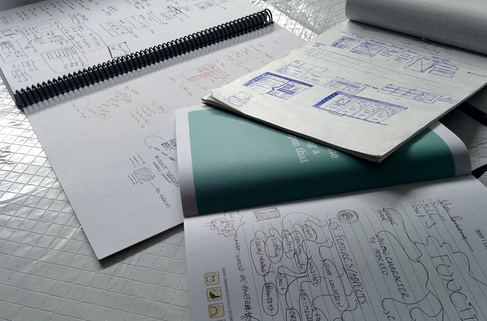 Today is something different again, why, because why not. I decided I wanted to have some fun so I made a fake app to be used by the main character. So let's start! The first thing was understand my subject. You have to filter out what is important, what is prevalent, and what is supplementary. So, I took notes of the major features in the game such as the game mechanics, game-play, functionality, and anything I found significant. What makes this game unique, what makes it different from other games? The features are the backbone of the game and function like top level features for sites, programs, and apps. Therefore the features would inform the top level functionality for the app. I turned to other aspects of the game such as personality, tone, atmosphere, story, lore, everything that would define and give character to the game. This part is like understanding your client and/or content. It helps understand what is important to them and sub sequentially the features for the app. You have to learn what are their beliefs, values, objectives, ideologies, what makes them them. After my research I started to filter out supplementary content, as in what were not essential to the game's functionality and uniqueness. I had my feature list now time to figure out the user flow. I had to make sure it made sense to the user (ie the main character). I did multiple versions to see if an alternate route would change anything for the better or for the worst. Some were simple some were complex, I tried to keep it as simple as possible because if the flow gets confusing it could translate as poor user flow in development. That's all for now, probably missing some stuffNext I will get into wireframes, can you guess the game :P 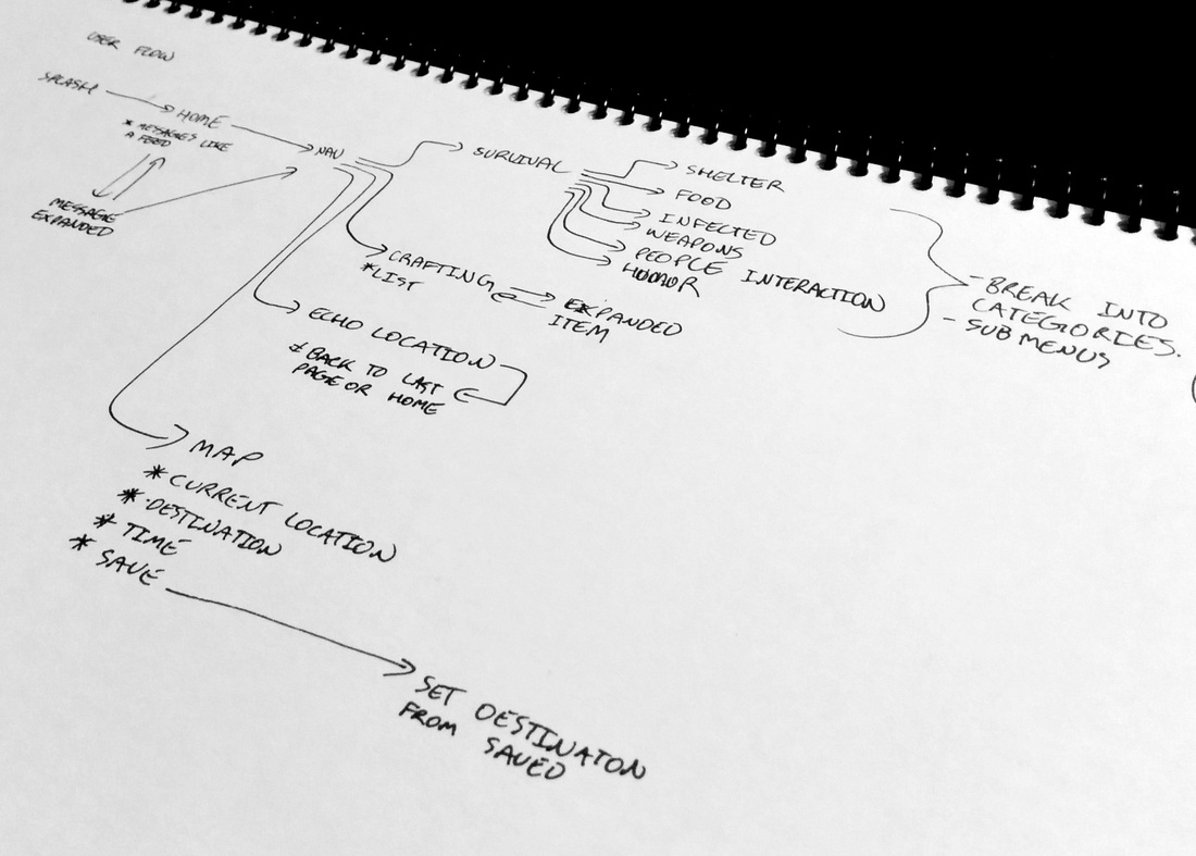 Instead of an infographic I decided to go with another passion and that is comics. This comic is about how looking for a job and finding a relationship are pretty much the same thing.
I thought about making this for a while now. I found similarities between the two based on my own personal experience but then I noticed I was not the only one who felt this way after speaking to friends, family, and other acquaintances. I realized now as I am writing this I forgot the "give me a chance" or "but I'm a nice guy" routine, maybe I'll throw it in the next one. Yes, this will be a series. The next one will talk about the beginning of a relationship and a job. I hope you guys enjoy! Cheers 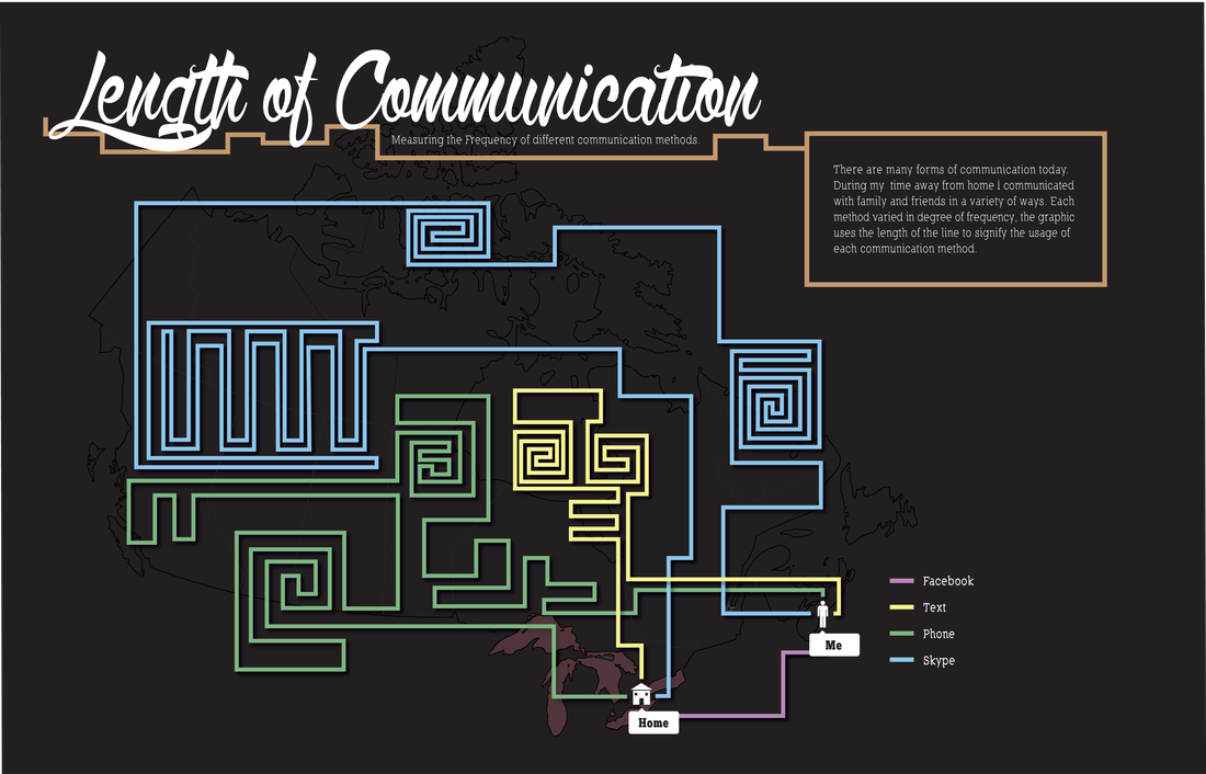 Alrighty, I know it's been a while, but work comes first. So I have been reflecting on methods of communication lately. We have phones, internet, and written (like anyone does this anymore). But then you have your subcategories such as texting, Facebook, email, Twitter, Instagram, Skype. Now that I think about it we rely on social media a lot to communicate. Social media outlets help connect people who would have never had contact in the first place, the benefit of globalization. Granted I feel personally we have come to rely on communication through text form rather then communicate face-to-face. A face-to-face conversation trumps text any day.
Over the past year I have come to rely on other methods of communication to keep in contact with people as I completed my masters. Here's a little infographic about the main methods I employed. 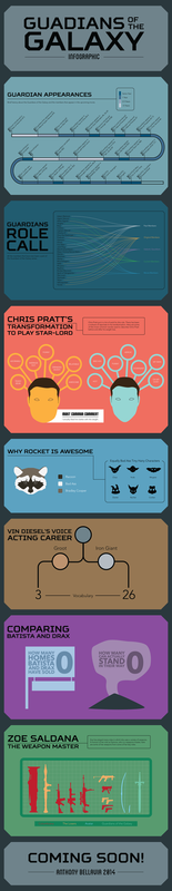 Alright now that my computer is back up and running on a new power supply I can post the next infographic. As you can see I did this one on the upcoming feature film Guardians of the Galaxy.
I love comics, there is no way around it. Every time I hear a comic is getting the movie treatment I get excited. It solidifies our passion for these stories and characters. We get the opportunity to show and share with the world why comics matter. I could probably go on a rant about how comics, and video games for that matter, serve as an important medium for storytelling, education, and the relationship between consumer and developer BUT I will digress. Enjoy! PS I hope it's good :P 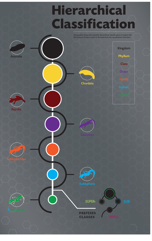 So my girlfirend was discussing with me the hierarchical classification of different species. She is in biotechnology completing her degree. She mentioned something that I found interesting but I didn't really know the basics of what she was talking about. So she told me about this classification system to start. There are different levels of classification for all organic life. This is but the most basic understanding of classification system, however, one needs to know the basics before one can move on to something more complex.
I can definitely see parallels between design and science. Both take a subject and dissect it (figuratively and literally) and ask questions. The great thing about scientific data is it is begging to be made into a graphic. Scientists and designers both crunch the raw data into something quantifiable, in this case, the scientist created a way of classifying and organize species on this planet. While the designer looks at the information and considers the best way to represent the data that is both visually appealing and easy to understand/read. I think I may go through her notes and find other things to make graphics about sciency things. FOR SCIENCE! Work of Amos Paul Kennedy JrSO ya, it's not an infographic. But hey! It's my blog. During my graduate studies at NSCAD I took on the role as a research assistant for the genius letterpress guru Joe Landry. I've done printmaking before but not letterpress. I found out that I love it. It has that rustic and vintage look. The great thing about letterpress is you get to actually see the human hand while printing and it is possible to individualize. What I mean is that each print could look slightly different due to over-inking, under-inking, different color mixes. No two prints could be the same. We live in a society where individualization or customization is king which illustrates the strength of letterpress. During my stay I was tasked to design the layout for Amos Paul Kennedy Jr's gallery show. Here's a link to his beautiful work HERE. Amos' work is bold and fun with a serious note. He is not afraid to be in your face with what he is saying. He does what designers strive to do all the time. I truly respect the man and his work. So you can imagine how I felt when I was told I will be designing the layout for his show at the Anna Leonowens gallery. Of course I did not work alone I had multiple professors guiding me when I was stuck and offering suggestions. The letterpress gang also helped me setup the masterpieces. I spoke to Amos about how he would like his work laid out and he wanted it to be sporadic. Essentially, he didn't want a traditional approach. However, I had to be careful because the show is about his work not my layout design; I needed to complement his work and his ideas. I ended up taking inspiration from posters hung on poles around the city. They are sporadic in nature. However, there still needs to be some structure. We divided the work into bulks to let the white space of the wall act as negative space for the eye to rest. Each grouping was a repeat of the first. We made them look different by moving the first row to the end. The posters were hang using magnets. We purchased metal tracks and screwed them into the wall. This ensured minimal wall repair and protected the work from any punctures of pins or staples. It also meant it was easy and quick to take the show down for after. My respect goes out to Amos Paul Kennedy Jr, Joe Landry, the professors of NSCAD, the Letterpress Gang, and all letterpress artists. 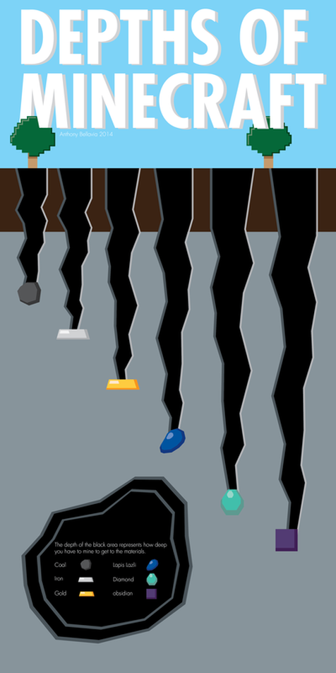 Minecraft infographic Hello all,
Today I feel like talking about another game, Minecraft. Minecraft is a simple sandbox game. It is not the most impressive looking game but what it does best is allow for user generated content to flourish. It sets simple perimeters that allow users to experiment similar to playing with lego. Lego have particular methods for construction however it does not limit what could be created. Minecraft places an emphasis on the power of process. Many people actually enjoy the game for the process of creating something rather than the finished product. It goes with the whole "it's not about the destination, it's about the journey." One could argue the game serves as an educational tool to understanding the importance of the process. The game relies on the users to continuously generate content. The focuses on the interaction between the user's experience and the content. In design, user interaction with content is important. It allows the user to become invested and connected with what you produce. Minecraft is not the only example of good user interaction. Facebook and Twitter rely on the user to generate their content, without the user none of these could exist. I could write at length on this topic but it will leave it at that. See ya! |
||||


