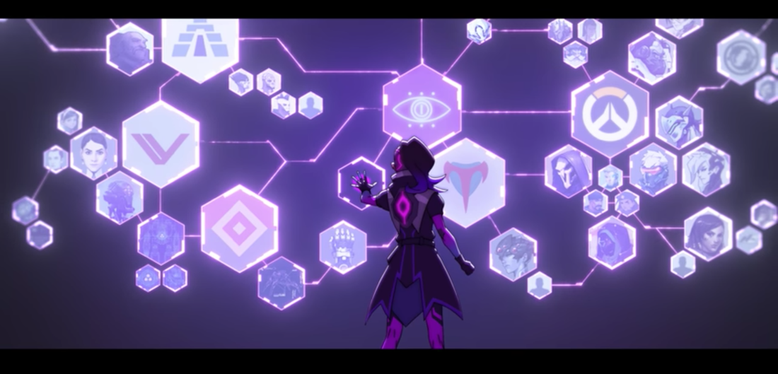
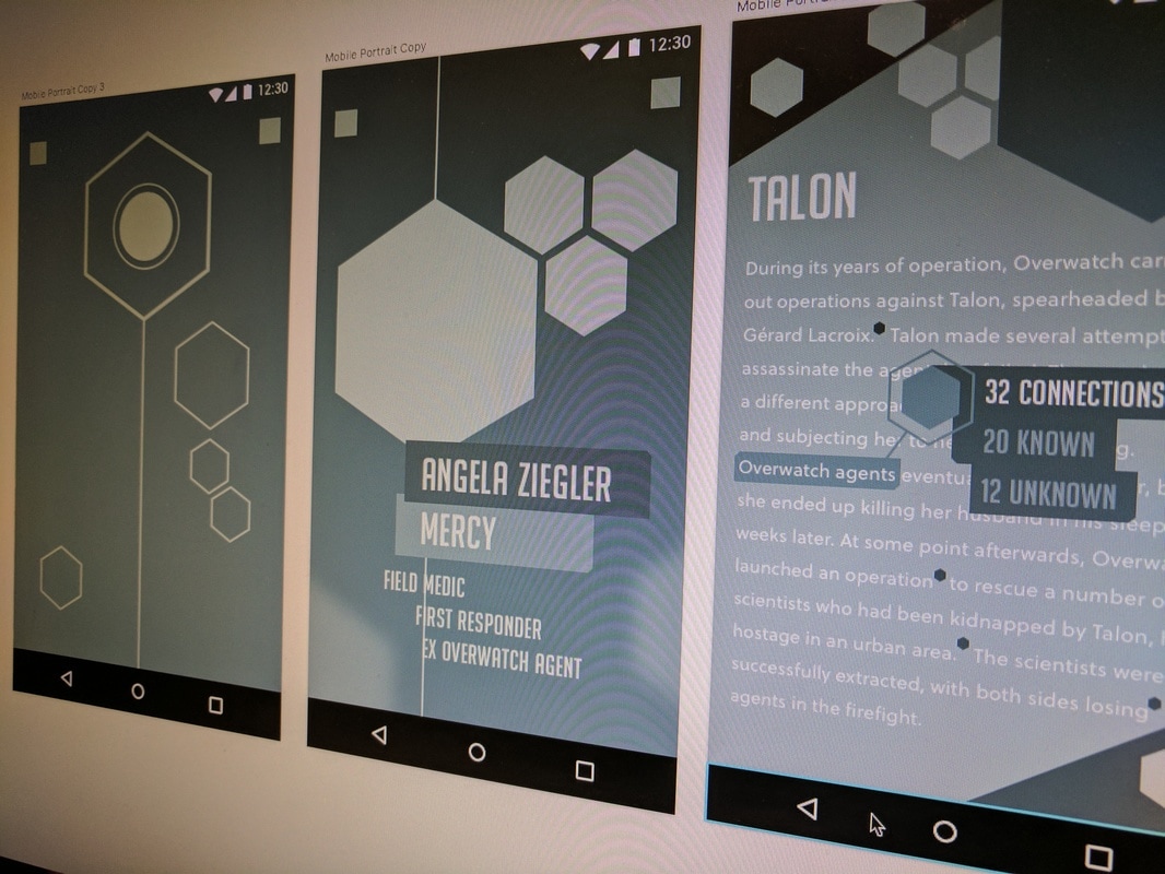
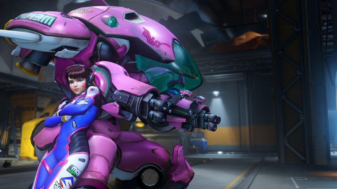
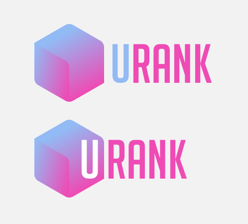
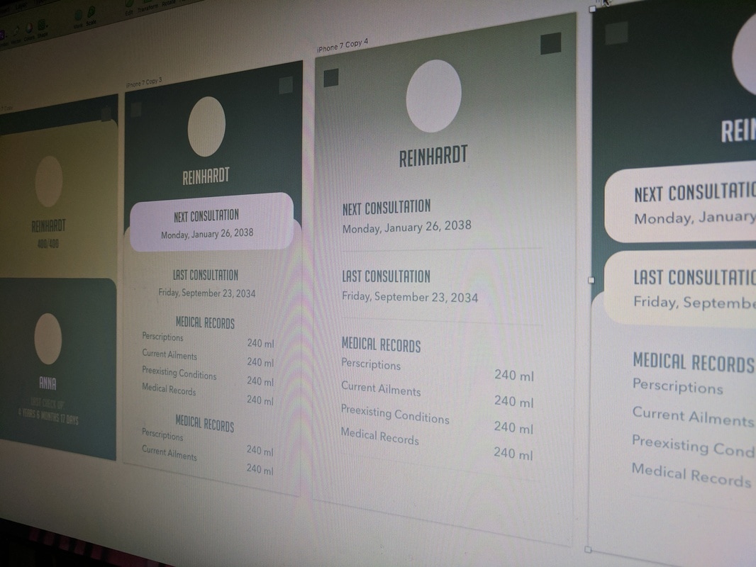
Sombra, D.Va, and Mercy AppsHello all. My next "Fake-for-Funsy" app(s) are based on the popular hero shooter, "Overwatch", developed by Blizzard Entertainment. For those that do not know I am a UX/UI designer in Ontario, Canada. I design fake apps for fun to keep myself fresh and come up with new design challenges for myself. Overwatch has a whole host of characters to choose from, each with their own personality and quirks. I choose to do an app for 3 characters in particular; Sombra, D.Va, and Mercy. There are several reasons for these choices. One, each character falls under a different play style or role; tank, attack (DPS), and healer. The second reason, I play these 3 the most in their respective roles (Sombra being my main and fav). Now the breakdown of how I went about designing the apps. In the past, I have done fully fleshed out app designs (full docs, flows, all screens), but this exercise was about rapid prototyping and smaller apps. I researched the lore behind each character. I had to understand their motivations. I checked each one's backstory, reviewed voice lines said during matches, and the overall aesthetic of the characters. At the end of my research, I documented a form of persona in a sketch for each character so I can start brainstorming what kind of app each character would need/want.  SombraWhen designing an app for Sombra, I focused on her primary ability which is hacking. Hacking was the most defining aspect of Sombra’s character. She is meant to be a little mysterious as a hacker should. I had to understand why she did it, was it out of the pure thrill? Was she taking to expose wrongdoing? was it to save lives? Watching her origin, I found the answer to my question in one line, “knowledge is power”. This was my basis for designing an app for Sombra. I needed to make an app that suited her primary need which was to gain knowledge. I started to review other knowledge based apps, such as those from newspapers, to see how they present their info. During my research, I went back to Sombra to understand how she digests her knowledge as many people take in info differently. One of my favourite images is of her in front of a string network of people, organizations, places, all linked like from some detective series when they are trying to link a murder. The network shows how information is connected and related (6 degrees of Kevin Bacon!). A good app/website example of the network would be Wikipedia. Wikipedia shows you information about your current topic but within the article, it shows related topics or subjects. With wiki and other news apps as a basis for delivering knowledge I moved on to presentation. I looked at Sombra’s costume for my palette and patterns. I also looked to other artwork/videos about her to get a sense of the style and UI she works with. Ambient glows and line work seemed to be best suited for her. For typography, I used the Overwatch font (Koverwatch) for headers/CTA and Soliel for copy text as the typography had an even weight throughout the characters and the curvature resembled her hair and other details on her body. Little here and little bit there and voila, “Routed” the information network app was born. 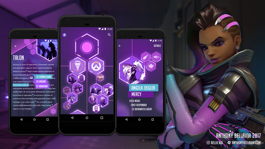 Article Screen The left screen shows an article about Talon. The user can see a back button to return to the network view of the currently searched subject. The bottom hexagon button gives the user access to particular options available for the article such as saving and sharing it. Searchable or keywords relating to other topics are annotated with blue hexagons, indicating to the user they are tapable. If the user taps them, it will show the number of connections in the network as well as the number of networks the user has already viewed and not viewed. The user can then tap the connections to see the full network. Full Network Screen The middle screen shows the full network of information based on what the user searched for or tapped as a keyword. The search result/keyword will be hidden unless the user taps the main hexagon at the top of the screen. This hexagon acts as the root of the network and below shows all related connections. Each connection will branch revealing other sub-connections. The connection physical size is equal to the number of sub-connections under it. Some connections will have too many connections to display at once and thus will appear as their own networks, which is represented by lines running from the connection to the edge of the screen. Users can see these networks by pressing and holding down on the network/connection and then swiping off screen. This will show a new network with the selected connection as the root on top. When a user taps a connection, it will show a detail view. Detail View The right screen shows a detail view of a connection. Best way to describe it is as a peek or a summary of the connection before accessing an article view. To access the article view of the selected connection, the user will tap details in the top right corner  DvaUnlike Sombra, D.Va has much more information about her character. However, because she had more didn’t make it easier. In fact, it was harder to find a focal point. Despite all of her interests I found that D.Va herself is very competitive (which is primarily evident in her voice lines such as “new high score” or “I play to win!”). She also trash talks her opponents during the match. She prides herself in being the best. So for her, a motivation would be to be the best and her need would be a way to see it. We know from her lore that she is a starcraft player and streamer (evident in her emote where she is streaming a game with over 9000 viewers). She probably wants to see how she stacks up against others in games and her numbers when she streams due to her competitiveness. Many apps such as Twitch and Youtube show their content creators analytics to track how they are doing. The difference here is D.Va is involved in more than one platform. When thinking of what to build I thought of password managers. Password managers work across multiple apps and accounts. I thought this could be translated into an analytics manager. Now that I understood what it was about, I moved on to the aesthetics. Similar to Sombra, I looked to D.Va’s mech for her colour palette. I looked at the contours of the armor to get a sense of how I things should take shape within the app. I also looked to Overwatch’s UI for the character selection and career profile pages. For Typography I stuck with the Koverwatch font for main headers and I parred it with Futura PT for smaller text. I thought the 2 fonts complimented each other well, having a similar style with slight variations. Thus came “URANK”, providing analytics and rankings across all platforms in one app. 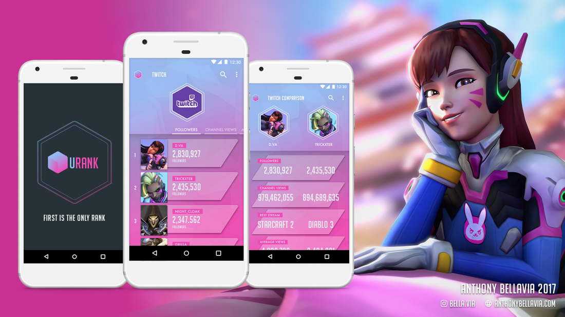 Landing Screen The left screen shows the apps loading screen. I really like how the logo came out. Ranking Screen The middle screen shows the ranking of each user within a particular category. Currently, it is showing ranking for Twitch followers. The user can change the category using the tabs just above the list (things such as most viewed stream, channel views, Average views, etc). To view the rankings of a different platform, ie; Youtube, the user can tap the logo in the top-left to open a menu with all the platforms the user is subscribed to (within this menu the user can add & remove platforms, and link accounts). A user can see details of each other user by tapping on them. Users can also compare in two ways. Tap the more button (top-right) and select compare users or press and hold a user and drag it over the other user they wish to compare with. Compare Screen The right screen shows the comparing screen which compares stats between two users. The user can search the comparison via the search icon at the top right or access the comparison options via the more icon in the same location.  MercyMercy’s motivations are not driven by her own needs, rather, they are driven by the needs of others. Unlike the other two, I found Mercy to be more transparent. She is a doctor and she takes her profession very seriously as it envelopes her life. She is a caregiver, most of Mercy’s voice lines show a genuine concern for the well-being of her team. Some call her the mom of Overwatch. She constantly asks other characters for check ups and to receive different treatments for lingering ailments. Mercy needed a way to help her colleagues or/and patients. I have seen medical apps before, each have their own focus on what they are addressing (ie; who is the stakeholder). In this case, I know my stakeholder is a doctor. So, whatever I designed would be from their point of view. So, the question arises, what would a doctor like Mercy need or want in a medical app? Like I mentioned earlier, Mercy keeps tabs on everyone’s health. I thought, how about an app to help her keep track of each of her patients. The visuals for this one, I referenced Mercy’s armor and other medical apps. Both are visually clean. They are minimal in design, focusing primarily on the subject rather than intricate details that may distract. Mercy’s palette reinforces the minimal design as it is full muted light tones. However, there are some parts of her design that show stark contrast in colour so I kept that in mind to do use sparingly. In the app, I used a generous amount of space and white to emulate the minimal style and giving it a clean look. I used other health monitoring apps as a basis for how elements should be spaced out. I rounded edges of elements to reflect Mercy’s peaceful demeanor. I strained away from the Koverwatch font this time and went with a thinner and taller typeface to stay consistent with the minimal muted tone. The font I chose was Avenir. In addition, I increased the character spacing to increase the amount of negative space and legibility. I chose to put most of the titles in lowercase to mute their voice. With a quick rez, “CheckUps” was brought to life, tracking all patients and their medical records. 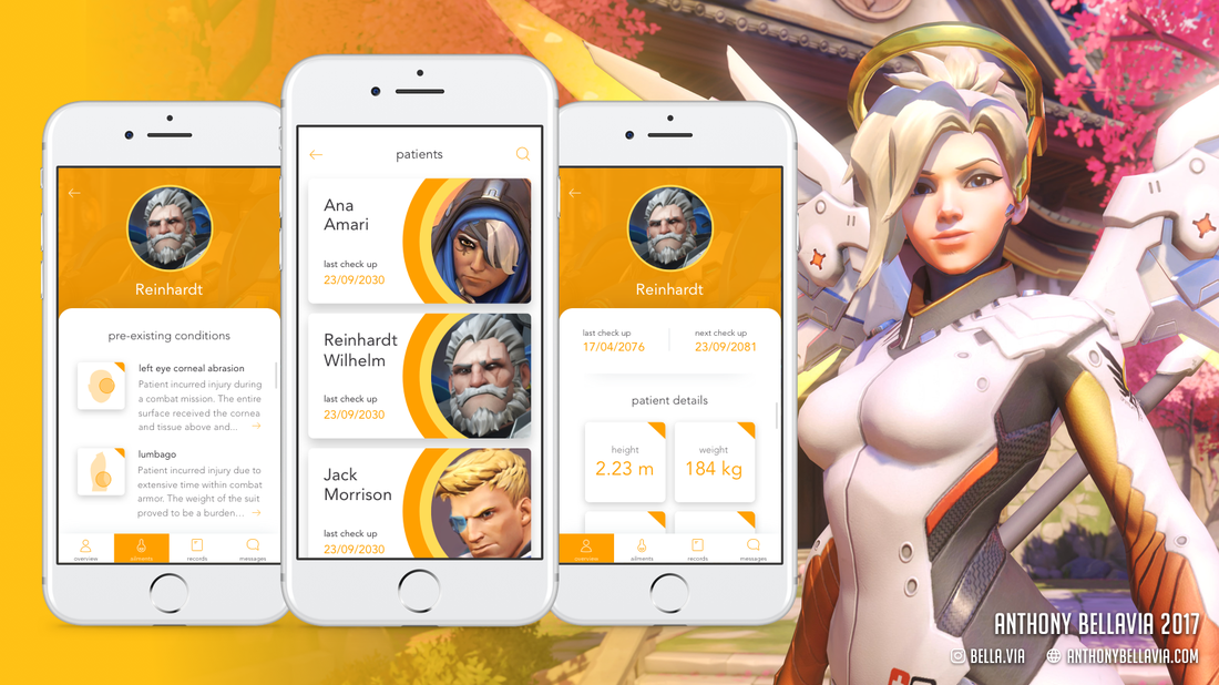 Patient Ailments Screen
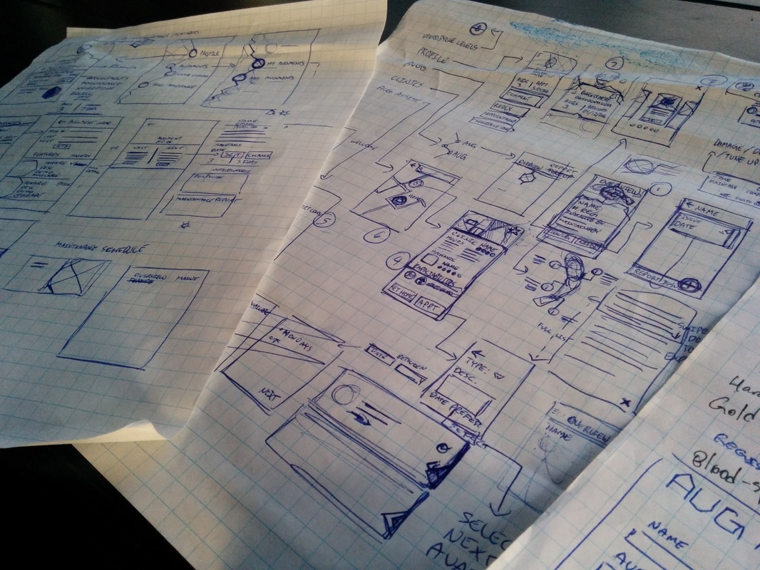
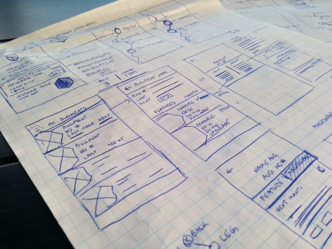
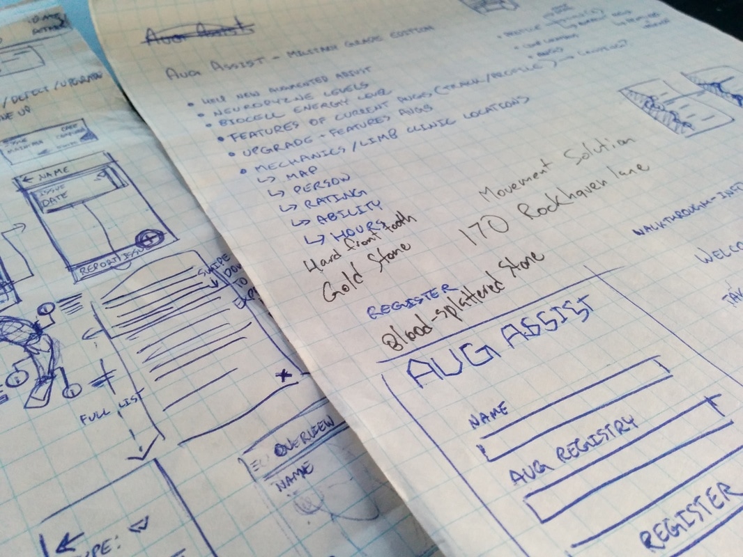
The left screen shows the selected patient’s pre-existing conditions. A user can tap the arrow icon at the end of each paragraph to see more details about the condition. At the bottom of the screen is a tab bar with 4 options; overview, ailments, records, and messages. The overview will be discussed shortly and the user is already viewing the ailments. The records tab will show all the appointments and any documents pertaining to the patient. The messages tab allows the user to directly communicate with the patient. The user can send messages here and the patient will receive them via their preferred form of communication. Lastly, the back arrow at the top will bring the user to the patient list screen. Patient List Screen The middle screen shows a list of all the patients. The user can search through the patients via the search icon at the top right corner. Back button leads to a feed with all updates and messages from all of Mercy’s patients. In addition, the user can add new patients on this screen. When the user taps on a patient, it will open a patient overview. Patient Overview Screen The right screen shows an overview of the selected patient. Each item highlighted in orange is selectable. The user can change any of the data sets by simply tapping them. As mentioned earlier, there is a tab bar available to the user. Click the image below to see the full app presentation.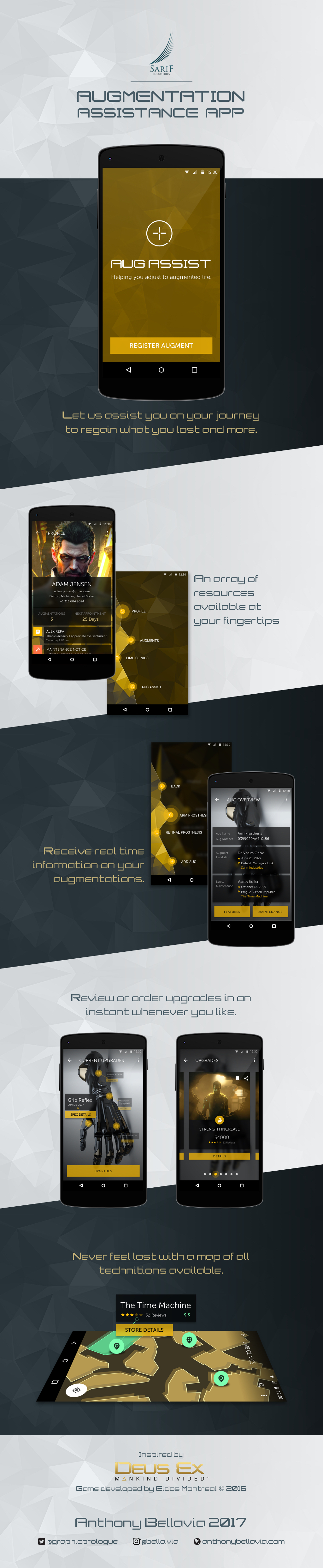 Hi folks! It’s been a while since I’ve done one of these. Here is my new “fake-for-funsy” app. This one is based on a game called “Deus Ex: Mankind Divided” developed by Eidos Montreal, published by Square Enix. For those that don’t know (If you do know the game, skip to the third paragraph), Deus Ex is about a dystopian future. The story is very social political, especially this latest game. The focus is a growing divided between normal people and augmented. Augmented people are those with robotic limbs or parts. Some people have them due to disease, accidents, or other incidents. While others got them because they wanted to simply be better, faster, stronger. Some might make the connection within our real worlds divides that exist, but that’s an entirely different discussion. When designing this app (If you want to skip the design philosophy , go to the five paragraph), I mapped out what are the important facets of the game. What are the core features of the game world, what defines the game and its world. After that I went through each point and tried to expand on them. I was trying to see where an app would be necessary. Considering it’s the future, they probably have programs doing a lot of things for them anyway. What I ended up focusing on are the augments themselves. Then the question became, what about them? What do I address? What do augmented people need specifically? In this case, I thought how do people adjust to their augmentations? I assumed, they are walked through the process of getting augmented, but what about after-care? I find after-care a problem in our current health system, where follow-ups are not as prevalent as they should. Anyway, these people have never had augments before. Just like having a prosthetic, people need to adjust accordingly. So, the question I came up with was, how can we help newly augmented people adjust to augmented life? Adjusting to a new way of life is an everyday battle, therefore an app where the user needs constant access would be appropriate. The next set of questions I had to answer were all focused on what a person would need to help them adjust? The 5 W’s were called into action here! Imagining myself as a person who lives in this world and just got augmented. I listened to the characters in the game to create my profiles. I made a list of possible requirements, however, it was quite cumbersome and bloated. At this point I had to distill the list, what is the bare minimum to make this app viable? What I came up with was users would need a way to track their information. This includes personal data relating to their augmentations such as features, maintenance, and record any issues. They would also need information about the augmentations they have; including but not limited to, definition of features, explanation of personal maintenance, answers to common questions, possible upgrades available for their augmentations. Users would also need to know where to go for maintenance and who they could consult if they have any questions. Sometimes the best help comes from those who are going through the same thing, so a place for users to communicate such as a forum. So to review, augmentation details and information, aug features and upgrades, able to search/find maintenance professionals, track maintenance, provide support lines (both professional and other users). 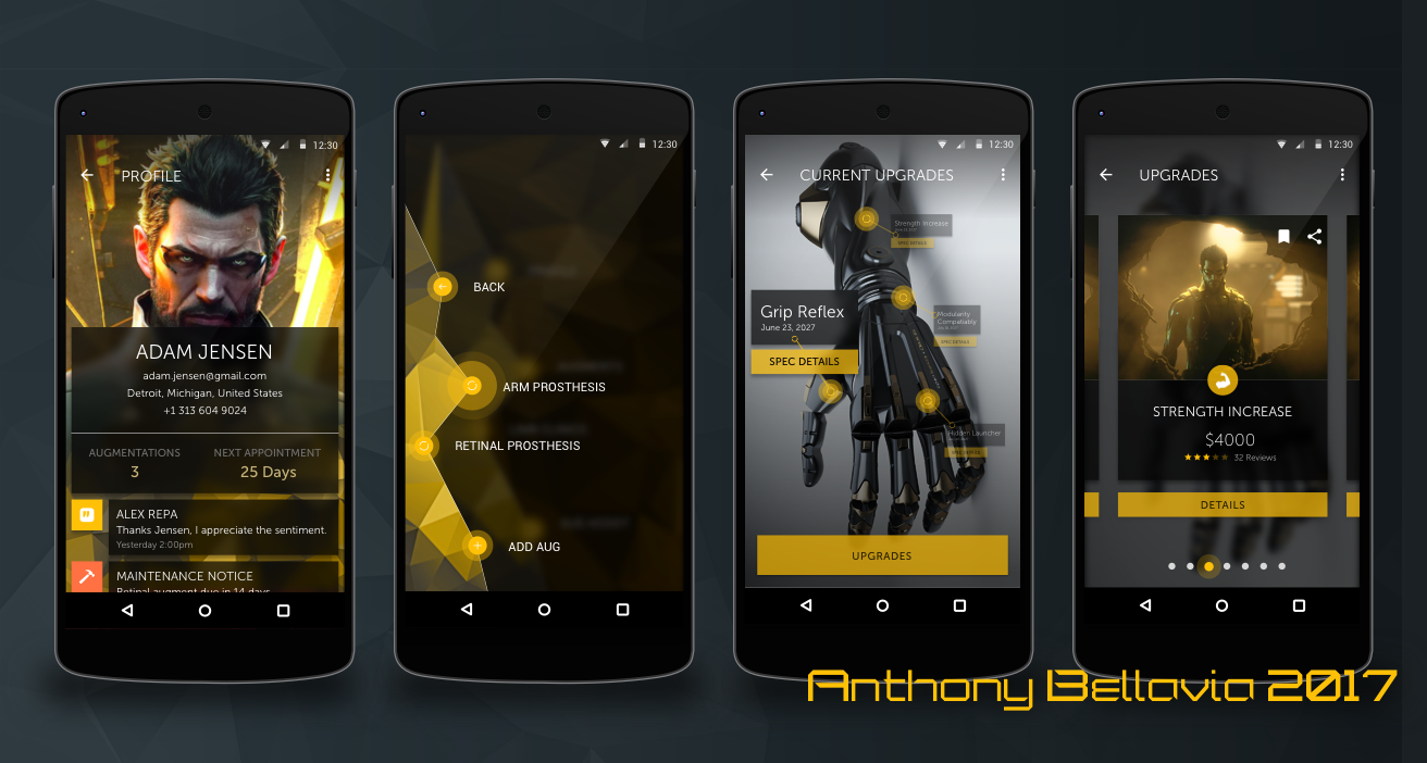 Aesthetics
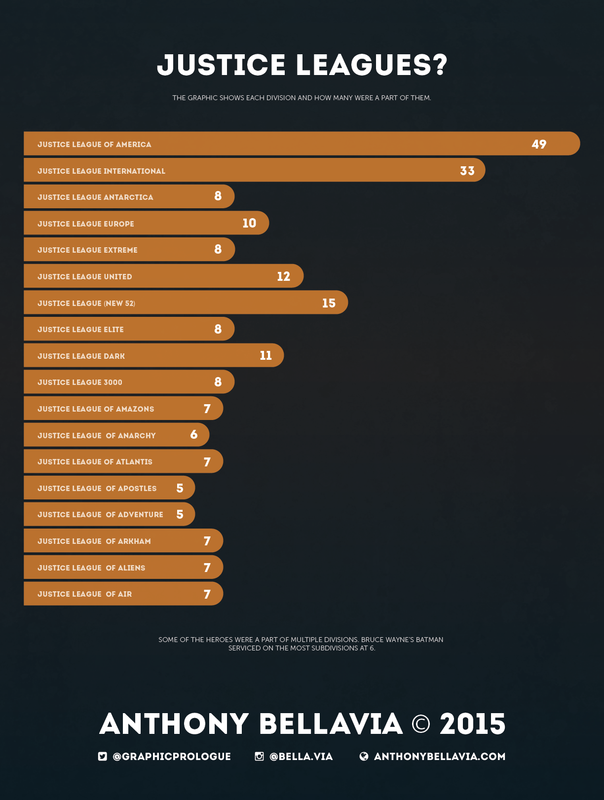
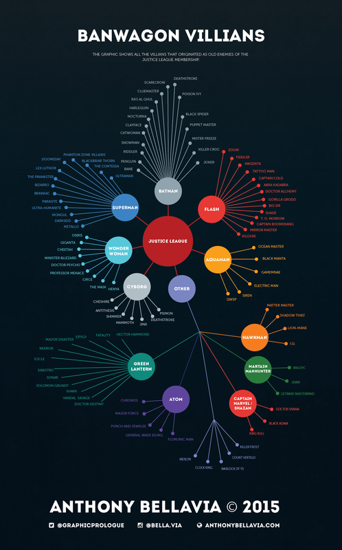
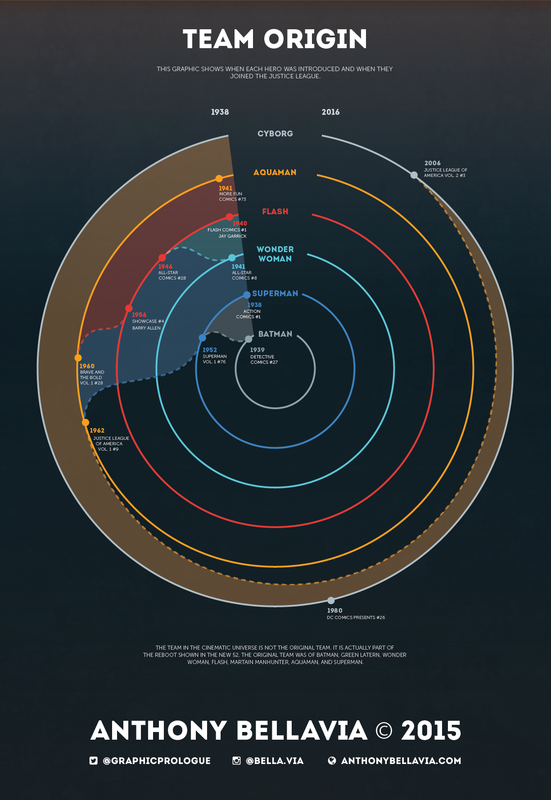
When it came to the aesthetics of the app, I focused on UI and atmosphere of the game. I kept colours, typography, and overall feeling as close as I could to the game to make it seem as if it really could exist there. How it Works? The way this app would work is when a patient would get their new augmentation, their doctor/professional would help them register their aug with this app. The doctor/professional would enter details on their augmentation and the procedure. The patient themselves would enter in their details such as name, email, and possibly health card (if country the patient is in has such a system). It here the two can have a dialogue about how to use the app. Now let’s go through the features of the app. Once the patient logs in, they will be brought to the app menu as the home screen. There are four major menu options; profile, augments, limb clinics, and aug assist. Profile The profile displays the user’s information. It also shows their profile picture, number of augs, and next appointment. Below this information are notifications, whether they be from the aug assist function, maintenance, or any other important information the user needs. The notifications, if tapped, will bring the user to the appropriate page to address it. The user can edit information and settings via the overflow icon in the top-right. Augments When a patient taps “AUGMENTS”, the menu will recede as it blurs and darkens. A new submenu be in the foreground listing all the patient’s augmentations as well as the ability to add more if needed (This function will primarily be handed with the doctor/professional). When they select an augmentation, it will open an overview for it. The overview will state the name, registration number, installer, and last maintenance. If someone needs to edit something here, they can go to the overflow menu to do so. At the bottom the patient has 2 options; view features for this augmentation or view maintenance log. The maintenance log will list all the appointments made with detailed reports available for viewing. It will also show the next upcoming appointment. If there is no next appointment, the area will be filled with the option to set one up and serve as a reminder that they will need one. The user can also setup an appointment by clicking the floating button at the bottom-right. This will open a dialogue screen where the patient will select a location, professional, date & time (the patient can save location and professional for return appointments). The patient will receive notifications as their appointment approaches or when they need to set one up. The features screen will show a rendering of the augmentation with pinpoints to where current features exist or affect. The latest feature will be in the focus / foreground as the others will recede, becoming translucent and blurred. The patient can select which feature to focus on by tapping them. If they want more details on a feature, they can tap “SPEC DETAILS” to open a new page with the feature details (cost, current maintenance, updates, function, date installed, and by who). The patient can also check for new upgrades by tapping “UPGRADES” at the bottom. This will remove all indicators for current features, then darken and blur the augment rendering. In the foreground will be the upgrades from left to right in a card style. Starting from the top of the card down, patients can bookmark or share upgrades. To access the bookmarks, patients can use the overflow menu at the top-right. Next is a sample rendering example of the upgrade in question. After that, patients will see an icon representing the classification of the upgrade followed by the name of it. To round out the card, the price, rating, and reviews (patients can click on the reviews to view them). Finally, if the patient wants more details on an upgrade they can tap “DETAILS”. Within the detail page is where the patient can purchase and setup the appointment. The purchasing is not on the card to prevent accidental taps and to make sure they themselves are sure they want it. Limb Clinics This function works with maps and geo-location. When the patient enters the screen, it will show all clinics closest to their position. For advanced users, they can use the overflow to change the distance, set to show most used/visited (by the patient or others), and much more. The patient can tap a marked location to reveal high level details of the clinic such as; name, rating, reviews, cost, and the ability to check “STORE DETAILS”. Store details will open a modal window with the same information as the high-level details and hours, professionals’ names and ratings/reviews, if the patient has visited them before (clinic or professional marked with a star), and the ability to setup an appointment here by tapping “SET APPOINTMENT” at the bottom. Aug Assist When a patient enters aug assist, they will get a brief rundown of what it does and how it functions. Basically, it is a forum for other augmented to communicate and answer each other’s questions or connect on a personal level. Patients can also communicate with professionals via FAQs, assistance forums, and direct chatlines. The app itself will not be used for extended period of times. It is meant to be digested in small doses. The environment around them may reinforce their use. For example; an ad on a screen appears on a billboard for a new aug or upgrade. A person can check it out on their app right then and there. Another case may be an emergency and they need a clinic, they can check the map function on the app. Push notifications such as appointments will remind users to come back. While retention is important to apps in general, making it so individuals don’t need to rely on the app as much is the measure of success; allowing users to live comfortably with their augmentations. Reflection In retrospect, I think a component to directly link the patient to the doctor/professional would have been a good addition. Also a component to track neuropyzne levels for the patient so they know when they need more. Having a toolbar instead of a menu may have been more user friendly. In the discussion of menus, maybe having a settings option available in the main menu might be more efficient. I know I wanted to have something different for the upgrades and current features for varieties sake. But, maybe making them similar would have been best for consistency. In terms of upgrades, providing a different method possibly to purchase upgrades would make the experience a little better. While the limb clinic locator is helpful, maybe a button to set a home clinic function would help with repeat visits. As much as I think these changes would be a great improvement, I think a longer time away from the design and some functionality testing with users would either suggest something different or confirm my ideas.  On the eve of Batman vs Superman: Dawn of Justice, I decided to do an infographic on the Justice League itself. Got my preordered tickets for me and my friends (kinda excited for it!). Gotta say research on this was very difficult and the info was convoluted (which is why I typically avoid long standing franchises all together...). Anyway, I distilled the info into 3 graphics; team origin, team subdivisions, and villains of heroes becoming Justice League villains. First one is fairly simple, when the heroes started out and when they joined the Justice League. The Justice League actually formed in 1960 however, there was already a superhero group called the Justice Society of America (1940) which was formed by founding League members Flash and Green Lantern. It should also be noted that the team shown in the new film are not the original team rather they are part of the reboot of the new 52. The original team comprised of Batman, Superman, Aquaman, Wonder Woman, Flash, Green Lantern, and Martain Manhunter. Second concept works with the variety of Justice League subdivisions. I know there are more superhero teams but I focused on the teams with “Justice League” in them. As I mentioned in the graphic, there are heroes that have been a part of multiple subdivisions, Bruce Wayne’s Batman served on the most teams. Green Lantern and Flash actually have been on more than him but they were never the same Lantern or Flash (Flash ie; Hal Jordan, Guy Gardner, John Stuart, etc) The third concept draws from the villains themselves. The Justice League has their own villains but I wanted to focus on the villains of the individual members. Each hero has their own villains, when the heroes became members the villains also became enemies of the league. I find this rather fascinating as some villains that I thought were archenemies of one hero actually originated as an enemy of another. I also saw have some heroes carried more villains over such as Batman while heroes like Cyborg did not. Cyborg’s main villains that crossed over were those he faced when part of the Teen Titans. In terms of design, I was sticking to the flatter style that I usually use. Big influence goes to Tim Leong, I love his superhero infographics. However I felt a little texture would suit the films well. Tried to stick to the dark color with hints of yellow hues. The graphic colors themselves derive from the characters but needed some adjustment due to the dark background. I used 2 fonts, Museo Sans for the smaller font and for Display is Intro. Below are the graphics seperated out Hi everyone!
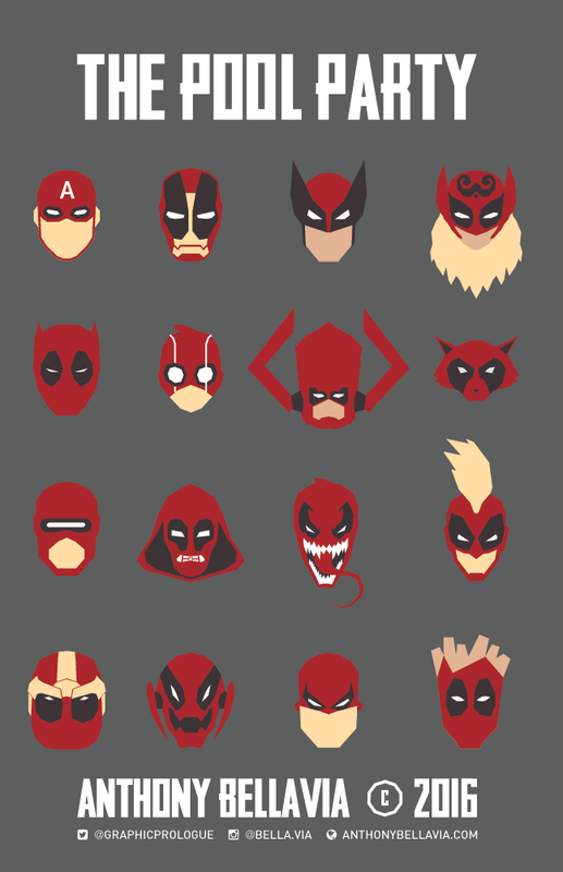
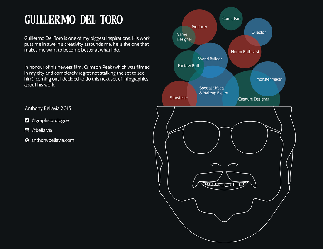
So super excited to go see Deadpool tomorrow. Finally a rated R superhero movie. Hopefully its good. I was going to do an infographic but decided nah wanna do some illustration instead. So here's a pic of everyone getting into the Deadpool spirit.I kept it minimal. Might do a few prints and T-shirts soon of it. Enjoy! Oh and Happy Valentine's Day. Click the image below to see the full infographic Hey all, so in honour of Del Toro's new film, Crimson Peak, coming out I decided to do an infographic about the man who has always inspired me. I love to create and draw new creatures and monster. Something about them reminds me of me, of us all actually, because like monsters we are flawed, imperfect. Every scar, bruise, deformity, personality flaw, they all make us who we are. So by extension, I feel I am personifying my flaws and imperfections when I draw these creatures. When I see the creatures Del Toro creates and brings to life it reminds me of this sentiment. While his creatures are flawed they are perfect and beautiful in their own way. The forms of his creature designs tell a story of their own, what they are, where they are from, and what they have been through. He never ceases to amaze me, especially in the way he tells his stories. I may not be drawing creatures as much these days but what I learned from making them I adapted into what I do now. It may not be creating monsters but it is still creative. Del Toro still teaches me about pushing boundaries (new design styles) and surpassing limitations (time, budgets, resources). Cheers, to the man who continues to inspire and drive my creativity. Below are the individual screens of the infographic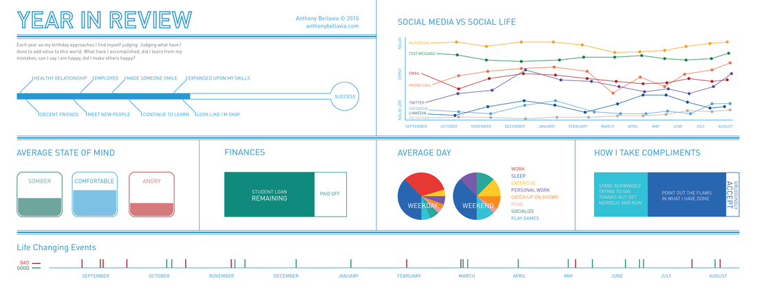 Hello, everyone. Today (September 23) is my birthday. Yay....... the thing is I dislike my birthday. For me it is a time where I am anxious and of a somber mood.
There are 2 reasons; past experiences pertaining to this time (which I won't get into) and the second is it is a time of reflection. For me, my birthday is the start and the end of the year. This is the time I evaluate what I have done, what I have accomplished if anything. I dwell on my own self worth and question if I have added anything to this world or to anyone else's life or have I simply become a burden and let everyone down. Normal I reflect on all my missteps, faults, and failures. This year feels the same but this time I am going to try and focus on more neutral or positive things. From that I created this infographic. The infographic is meant for a two page spread but will combine it together. SUCCESS So starting with the first graphic, I decided to measure if I am successful or not. Everyone has goals they strive for, some achieve them and some go their whole lives trying to obtain them and never succeed. Some people achieve them and set new ones to strive for and disregard anything that came before that (yeah, I think I do that). While I believe no I am not I decided to include the points that bring me closer to that point. STATE OF MIND Let's face it we are never always happy or always sad. The way we feel varies time to time, week to week, day to day, minute to minute. Different states of mind affect us all differently as one state may motive another may hinder. I believe the strongest and most stable person is not one who is comfortable and never sad or angry all the time; rather, I believe they should experience the range of emotions and be okay with the struggle. I believe we should accept the way we feel and try to remember like everything it will pass. The primary 3 I focused on recording throughout the year were sadness, comfort/okay, and anger. FINANCES Money. Despite what anyone says we need it. The hard thing is to try and not stress about it. Without getting into detail I decided to focus on something many people are use to having, student debt. LIFE CHANGING EVENTS We all go through numerous experiences throughout our lives. Some fade off into obscurity while others change our lives for better or worse. They mold who we are and who we will become. I decided to record events that I felt changed me for better or worse, either way they are who I am. SOCIAL MEDIA VS SOCIAL LIFE Most of my friends know that I am not a facebook person. I prefer to speak with people in person or even by phone. I believe social media has done so much to connect people and learn about things you would have never seen on your own. But I have found it quite impersonal and does not match sitting down at a coffee shop and having a conversation. I have mapped out my social interactions throughout the year whether it be in person, phone, email, text, social media, whatever. AVERAGE DAY Everyone has their daily routines. It helps direct us and drive us when we are stuck. For me routine saved me more times than not, it helped keep me focused. I mapped out my daily routines based on weekdays and weekends. HOW I TAKE COMPLIMENTS I have serious problems with accepting compliments or appreciation. I am hyper critical and aware of myself. I see where I have made an error and where I can improve in everything I do. This being said it becomes problematic when trying to accept a compliment when I know there are faults. After doing this one I think this year I am going to try and accept more compliments without self criticism Hello all!
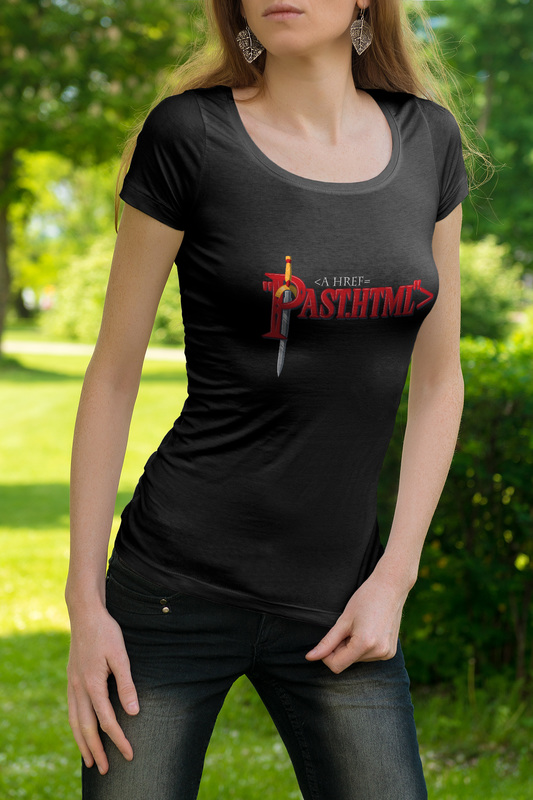
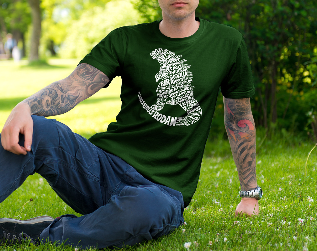
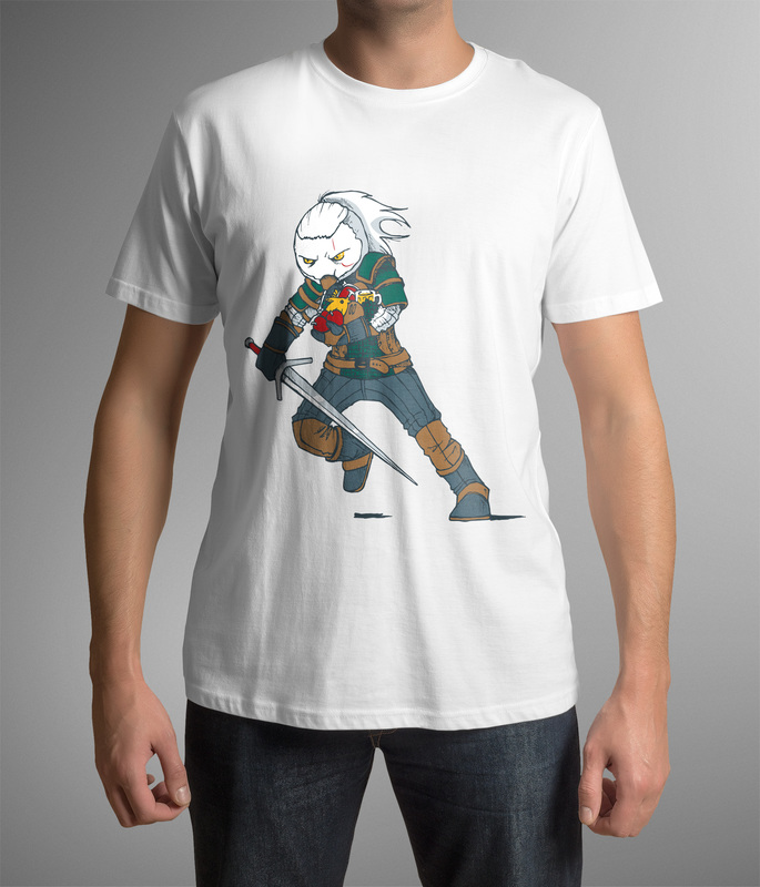
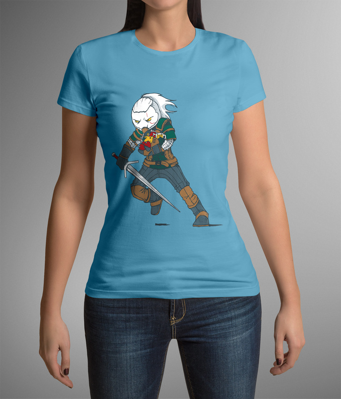
So this one took a while due to friends and family making me go to events because it's summer.....(Hm that actually makes it sound like I'm complaining that I have a social life, first world problem?) Anyway, I decided I want to do T-shirts this time based on several things I like. I employed a random sampling selection method for choosing the subjects for each shirt... I picked names out of a hat. So, here we have a Zelda shirt, Godzilla shirt, and 2 variants of a Witcher shirt. *If anyone is interested in getting one let know and we can have a conversation. I am doing a short run and don't want to do any more until I know there is interest for these.* The first shirt is a little geeky (what am I saying they all are :P) It is Zelda: Link to the Past using html code to link to something....get it (insert pun husky picture here). The second I wanted to do for a while. Using the names of all Godzilla's enemies to form his body. This kinda refers to him being the king of monsters. It was actually quite difficult because I have not done hand-made type in a while. The last is a reference to Geralt in the Witcher series (Yes I have beaten Witcher 3) Anyway, I always thought it was funny that you can heal (by eating food) while fighting. It got me thinking how that might look charging into battle. PS. Next project might not be ready until October due to time, work, and trying to find a printer for these. Click image below to see full PDF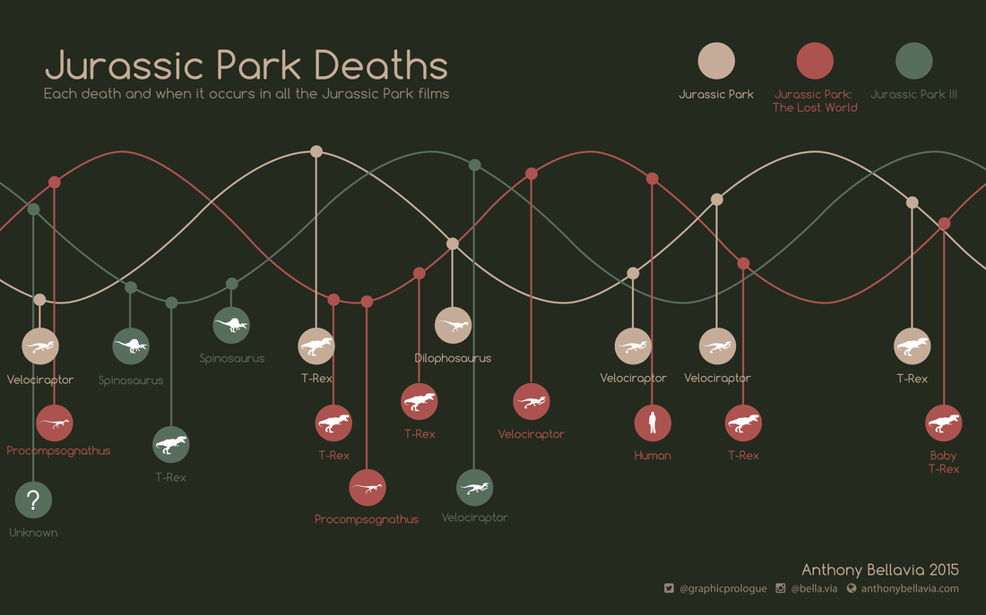 Hello again. I know I just recently posted a project but I'm going to be busy working on my next personal project and on projects for work so I thought I'd post the next one now.
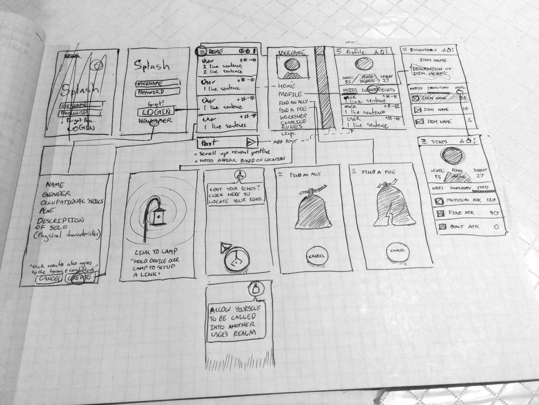
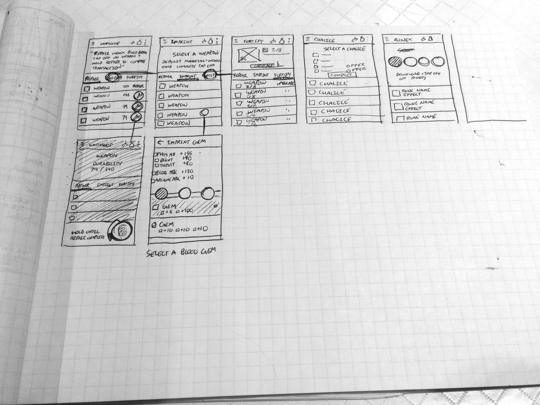
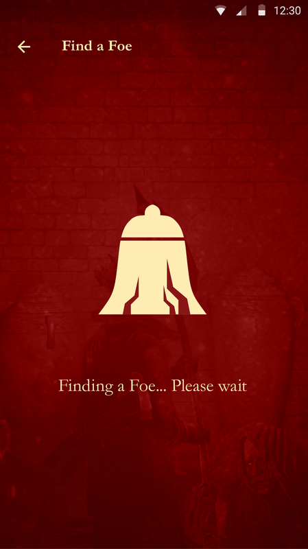
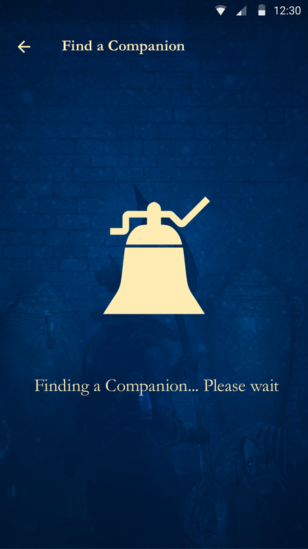
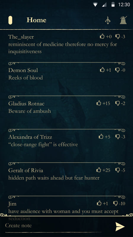
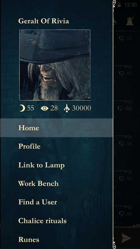
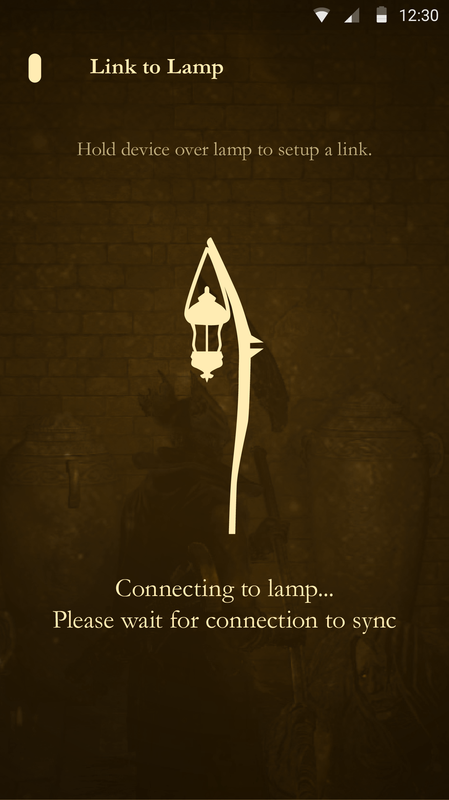
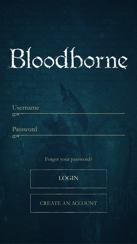
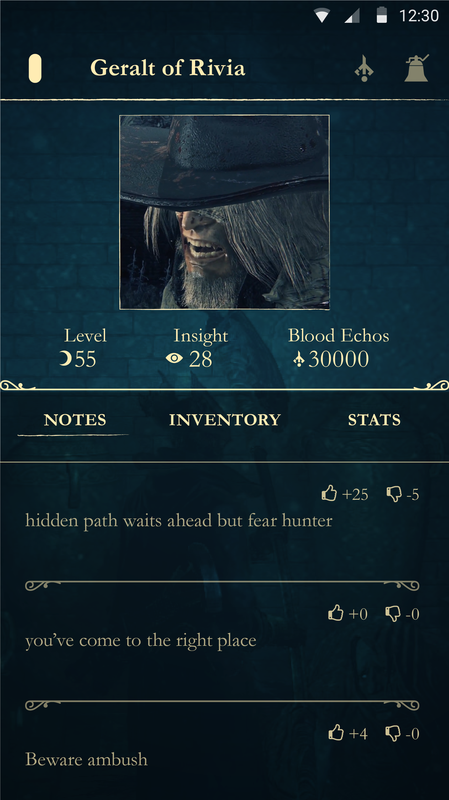
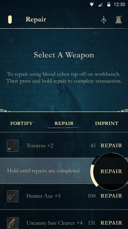
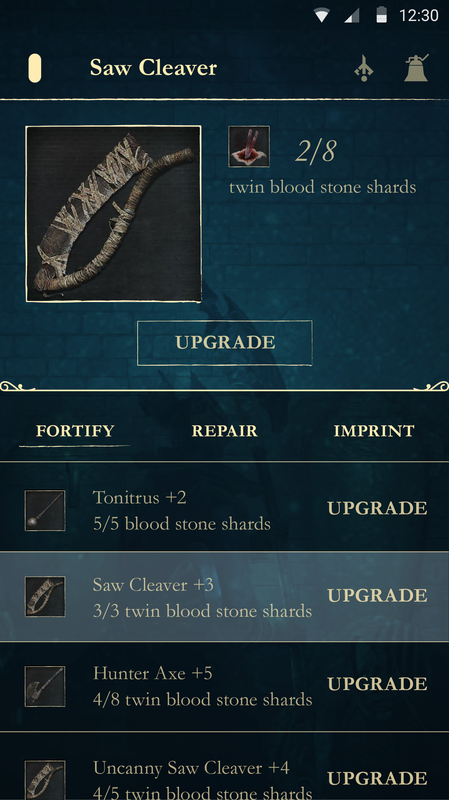
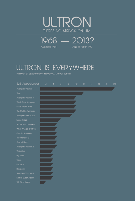
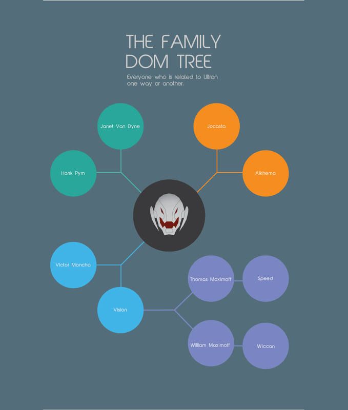
This time I choose to focus on my childhood favorite, JURASSIC PARK. I loved dinosaurs so much. Hell, one of my first words was apparently dinosaur. I even dressed as a dinosaur for multiple Halloweens (no you don't get to see those). I watched the films on repeat everyday all day (sorry to my parents). Anyway, after watching the new Jurassic World trailer it rekindled my love for these magnificent creatures. One of my first thoughts when watching the trailer was "Wow, I bet a lot of people would die in that park when the dinosaurs got out." So that is where the inspiration for this infographic came in. I watched the old films again and documented when a person died and by what means/dinosaur. Enjoy and see you in the theater....so excited! Click the image below to see the full PDFI did Last of Us last time, and this time I chose to do another about a game I adore developed by From Software, Bloodborne. Again this is simply for fun and to practice my skills. This app is meant to be used by the hunters. This is how I like to think the hunters know how to navigate Yarhnam... some what. Now there is a lot to the game which meant the app would be larger compared to Last of Us app. So instead of doing all the screens I did some of the more prominent ones for the mock up. Below is a description of how the app kinda works and wireframes done by hand, yes by hand. I wanted to do them by hand because well, I don't really get the opportunity to. Now let's get into it shall we? The UI mimics the style of the game going for that old decorative, Gothic, Victorian style. In terms of type, I chose Garamond because it is a nice serif font with wonderful letter forms and variation. On the Initial Launch you need to login which is like loading a saved game. Creating a new account will reflect that of creating a new character, ie; name, gender, profession, description of self, etc. The Home page shows all notes from other users and users can rating them. It will take notes posted in the immediate area firstly. At the bottom of the screen users will be able to post their own notes. Fixed navigation in the header has three buttons. First, the menu button is in the shape of the option button on the PS4 controller instead of using a hamburger menu or anything else. To the right is the blood echos button which would help the user track down lost blood echos and pick up new ones by holding the device close to the location. The most right button is the small chime bell button which makes the user available to be invaded or called on for cooperation. The Menu will show the user, user's level, blood echos, and insight. It will also house all the options for users to select. On initial launch of the Profile It will have the name of the user in the fixed header, a picture of the user, user's level, blood echos, and insight. The submenu below has three options; notes (user's posted notes) inventory (list of inventory items, number, and description when selected) stats (stats on character). Clicking Link to Lamp sets the device up to link to lamps across Yarhnam. Hold the device to connect to lamps. Clicking Work Bench opens up similar to profile style. It will open Fortify initially. In the main display area it will say "select a weapon" and a brief description how to use this section. Essentially, users tap device on work benches, weapons, to complete transactions and desposit materials. The submenu has three options again; fortify, repair, and imprint. Fortify lists weapons, materials needed and have, and a button to upgrade. Users must hold upgrade in order for a function to be completed. Selecting a weapon shows a larger image of the weapon, the materials needed and have with the material image, and another upgrade button. Repair lists weapons, durability, and a repair button. Users must hold repair in order for a function to be completed. Selecting a weapon shows a larger image of the weapon, the durability lost and max, and another repair button. Imprint lists weapons to be selected first. Once the user selects a weapon the screen advances to a new screen with a similar layout except the submenu is replaced with 3 slots. The top tells the user to tap the work bench to deposit blood gems. To fill a slot the user will select one and choose from the list below of blood gems. When the user selects a blood gem the icon of said gem will appear in the slot. In order to get back to the work bench screen the user must click the back arrow where the menu icon would be. Find a User allows the user to either find a companion or find a foe. Chalice Rituals is broken into two parts; top preview/detail area and the bottom list similar layout to other screens in this app. First the preview area will instruct to select a chalice from the bottom list. After selecting a chalice it will show in the preview area the materials needed as well as buttons to make "offerings". To conclude click the conduct button to start the ritual. Runes is broken into two parts similar to Chalice rituals (top preview/details and list) The top preview has four slot buttons with the first automatically selected. To fill a slot select a rune from the list below. When a slot is filled the image of the rune selected will appear inside 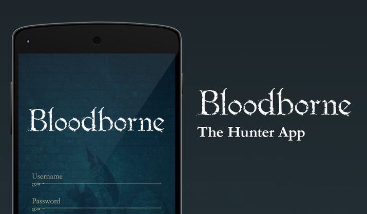 Click image to see full PDF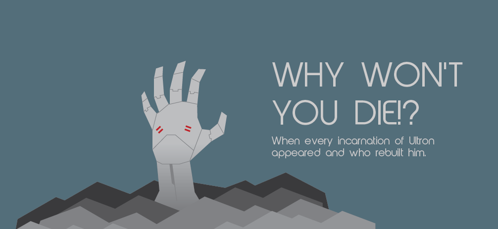 Hello everyone. I recently saw the newest Avengers 2: Age of Ultron trailer and I became overwhelmed with excitement. But suddenly I realized I don't know much about Ultron. I began my research into the tin man (sorry, Vibranium man). And wow does this guy have a history, he even changed genders at one point in time. Alas, I thought I can't be the only one who doesn't know him and so I made this infographic to give a little incite into his character. Enjoy! Hail Hydra :P Below are close-ups; |